Overview
As the product owner and lead designer, I…
- Wrote the product requirements for the idea form and project page builder
- Designed the idea form, page builder, fiscal sponsorship and budget flows end to end, co-designing them in workshops with the Customer Success team
- Got Customer Success to agree on one definition of each pipeline stage, so ioby could measure where leaders dropped off
- Interviewed 17 users (7 project leaders, 7 donors and 3 potential leaders) and pulled ioby’s funnel and sourcing data from Metabase to base design decisions on tangible data
- Tested the finished platform with 4 project leaders and turned their feedback into fixes before launch
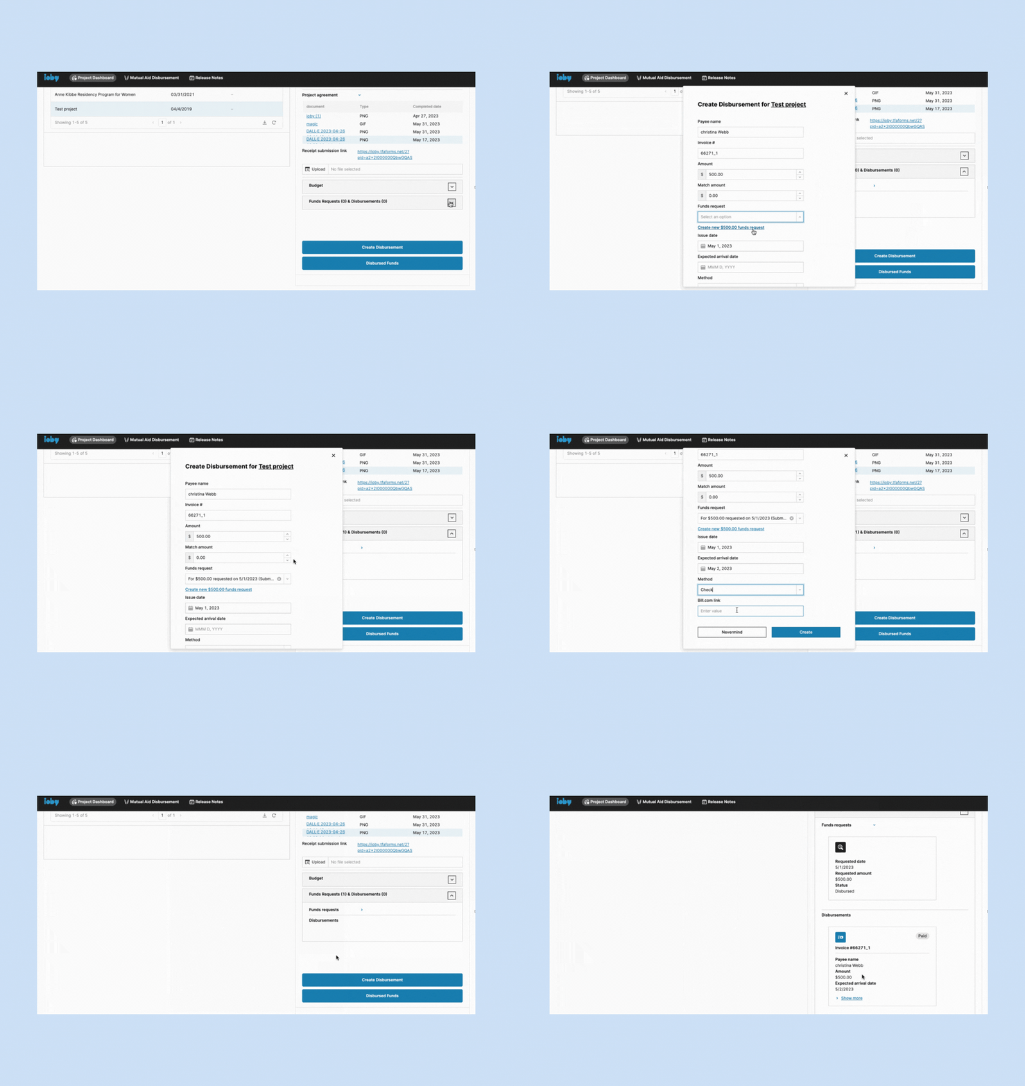
- Replaced a disconnected third-party intake form with one built into the platform
- Built ioby’s first component library in Figma for our engineers
problem
A clunky site with untrustworthy data
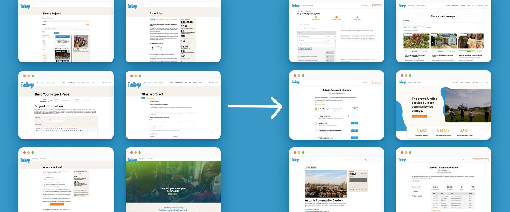
ioby.org ran on Drupal 7, which was reaching end of life, and needed to migrate to a more modern tech stack. The site looked dated and was hard to use; one person I interviewed said it looked “stuck in 2012.” Some project leaders also didn’t understand how ioby worked, which meant Customer Success spent a lot of time clarifying through emails and calls.
Most ideas never became fundraisers
Drupal also wasn't well equipped to capture data ioby could use. Project budgets were written in free text in rich text editors, the idea form lived in a separate third party tool, and many decisions rested on guesses. The data that did exist showed the cost. About 61% of ideas were cancelled, many as spam or projects ioby couldn’t fund. ~9% of project ideas submitted stalled right after the idea form and never became a project page.
Lack of content clarity cost staff time too. The stage right after a leader shared an idea, Customer Success spent about 15 minutes on an experienced user and 45 minutes on a first-timer to crowdfunding. Much of that went to explaining how ioby worked and eligibility criteria, not coaching. The ideal was that the idea form provided enough data that staff didn't have to spend more than 5-10 minutes evaluating a project's eligibility to fundraise on ioby.
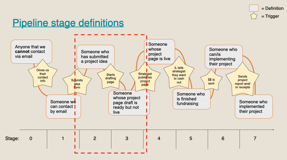
Three goals for the rebuild
The rebuild had to collect the same data Drupal did, because our internal data was being migrated at the same time (see work on internal tooling here). Given that we were building the crowdfunding product ourselves, we had liberty to improve the UX, especially when the core product was essentially a long data-entry form. We took this as an opportunity to make simple but high impact improvements to the user experience that addressed years of user feedback without compromising backend data collection and migration. Improving how every question was asked and what ioby captured from the answers were the priorities.
Easier to use
Short sections, visible progress, help text and a mobile layout.
Clear about how ioby worked
Eligibility, fiscal sponsorship and fees explained where leaders needed them.
Built to capture data
Structured fields that made projects searchable and gave ioby real numbers to decide with.
Research and insights
Why leaders stalled
I interviewed 17 users, read through five years of NPS comments, pulled funnel and sourcing data from Metabase, and shadowed Customer Success staff. Leaders split clearly into experienced fundraisers and first-timers, so every design had to work for both. Four insights shaped my work.
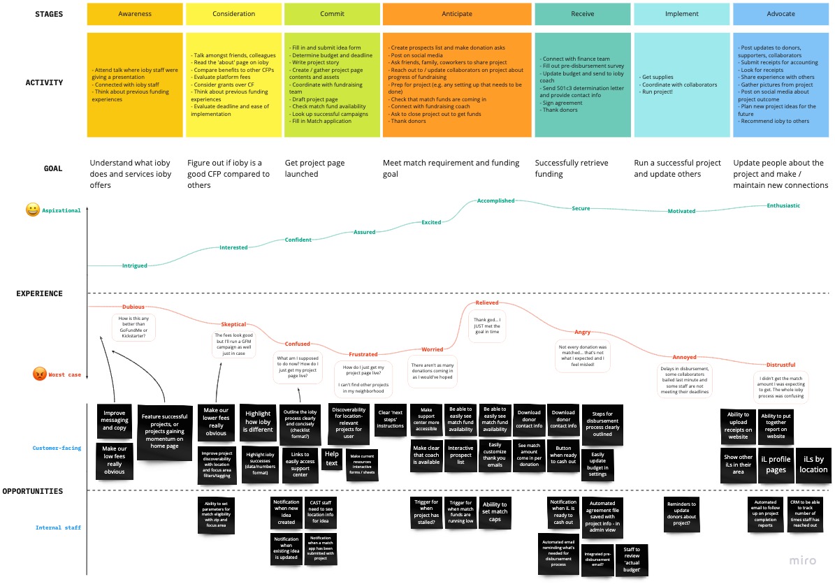
Leaders didn’t know if their idea qualified
Many expected ioby to work like GoFundMe, but ioby funded only US-based, public-benefit projects. Every dollar raised had to go to the project, and many leaders found this out only after submitting an idea form and talking to Customer Success staff member.
“I remember being confused about what [ioby] was.”
Leaders didn’t know they could keep going
After the idea form, leaders saw “hang tight while our staff reviews your idea.” They could already start drafting, but the button sat at the bottom, so most leaders simply waited for an email from an ioby staff member. The review was there for ioby to filter spam and ineligible ideas because that was a serious problem ioby had as a result of using a third party tool, The Form Assembly, embedded into Drupal, not to stop leaders from drafting.
Fiscal sponsorship and the budget needed the most hand-holding
These were the two sections where leaders got stuck most. Customer Success coached leaders through these sections both by email and phone/video calls, and spent more time explaining fiscal sponsorship than anything else. Budgets came in as free text or pasted spreadsheets, and staff had to add fees manually.
“We spend a lot of time explaining that we are a crowdfunding platform because we do fiscal sponsorship.”
People who found ioby through search gave up most often
Web search brought in more cancelled projects than referrals or events. New visitors couldn’t tell what ioby did, and crucial information like ioby's fiscal sponsorship services were hidden in ioby's information architecture.
“When I found ioby and went on the website, I thought it was for grants.”
Process
Designing a step-by-step user flow
Staff had years of feature requests for the public site, but our priority was to build a sustainable foundation given ioby's backend tool spraw. I scoped the new ioby MVP to put our design effort into how each question was asked rather than adding on new features: content presneted in chunks, progress shown at every step, help text, autosave and a responsive design.
How the idea form evolved
Whether the project leader was a first-timer to crowdfunding or a power user, the idea form was every leader’s first step. However, the idea form lived in The Form Assembly, a third-party tool embedded in Drupal. Because it wasn’t connected to the rest of the site, it couldn’t send leaders an automatic confirmation, and staff had to manually link each idea to its Salesforce record on the backend.
We rebuilt the form inside a new tech stack, which allowed us to confirm every submission, save ideas leaders hadn’t finished, and carry their answers straight into the project page. It also asked five new questions so Customer Success could judge eligibility and coaching needs up front: impact area, past crowdfunding experience, type of team, any hard deadline, and whether they wanted 1:1 coaching.
How many questions to ask and why?
Strategists wanted the idea form to qualify leads up front, meaning they wanted to know not just the project idea but the leader's experience with crowdfunding, type of team they're working with, and whether or not they have a reasonable deadline and budget for their project idea. This was a lot to ask! Every extra question was another reason for a first-time leader to stop. Too many could feel like gatekeeping to the communities ioby served.
The tension
Staff needed enough to judge eligibility and coaching needs.
Leaders needed a first step short enough to finish.
What I decided
I went through each question with staff and asked one thing: could we get this answer later, in drafting or in a conversation? If we could, it came out. Contact details moved into sign-up, and more personal questions got a short “Why we ask” note.
Designing and iterating
My first draft was a conversational form that asked one question at a time.
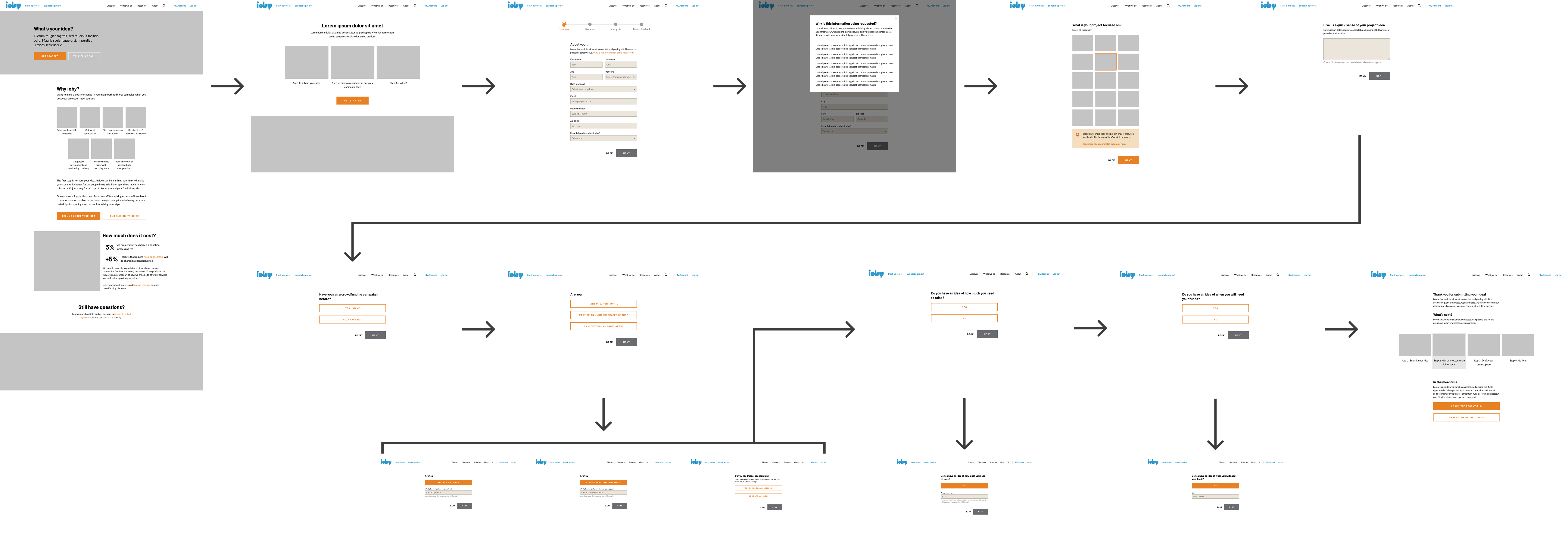
The feedback
The conversational form was easy to follow, but with the conditional logic it ran too many steps.
What I changed
A four-step form with a progress tracker, short enough for leaders to finish with ease. The form also required a US ZIP code, so out-of-country ideas stopped at the form.

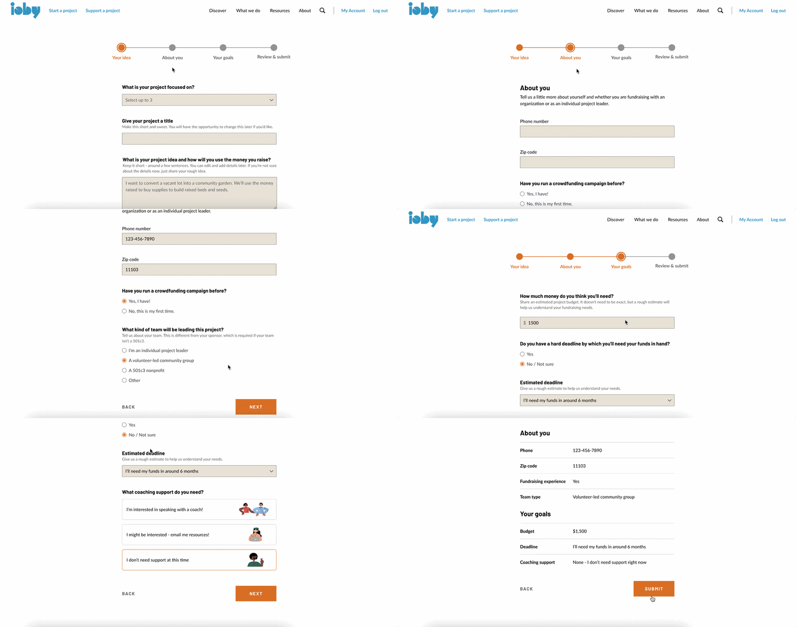
Making the next step obvious
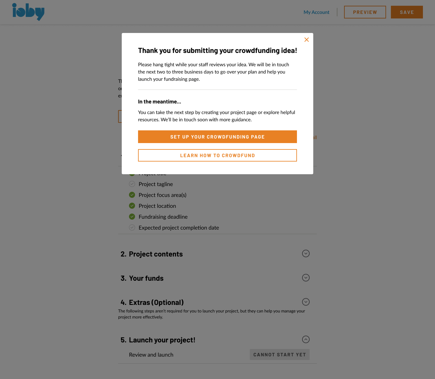
Even in the old Drupal flow, leaders were able to start drafting before staff approved their idea, it just wasn't made obvious. This review stop gap also existed for a reason: ioby was prone to getting spam project ideas, plus projects that actually weren't eligible for ioby. However, the consensus among staff was that leaders should be pushed to start drafting right after the idea form.
I moved the review message into a short modal and made “Set up your crowdfunding page” the main button, with “Learn how to crowdfund” beneath it for leaders who weren’t ready yet. Because the form was now built from scratch within our own tech ecosystem, it could also email leaders. Working with our interim CMO at the time, I wrote a confirmation message sent automatically after every idea submission, plus nudges at 3 and 5 days for leaders who hadn’t started a page.
I also wanted leaders to be able to publish on their own, which was a common action users could take based on my research on other crowdfunding websites. In the end, we agreed that was a step too far for the first release, so staff still approved every project before it went live.
Redesigning the project page builder from a long form to a checklist
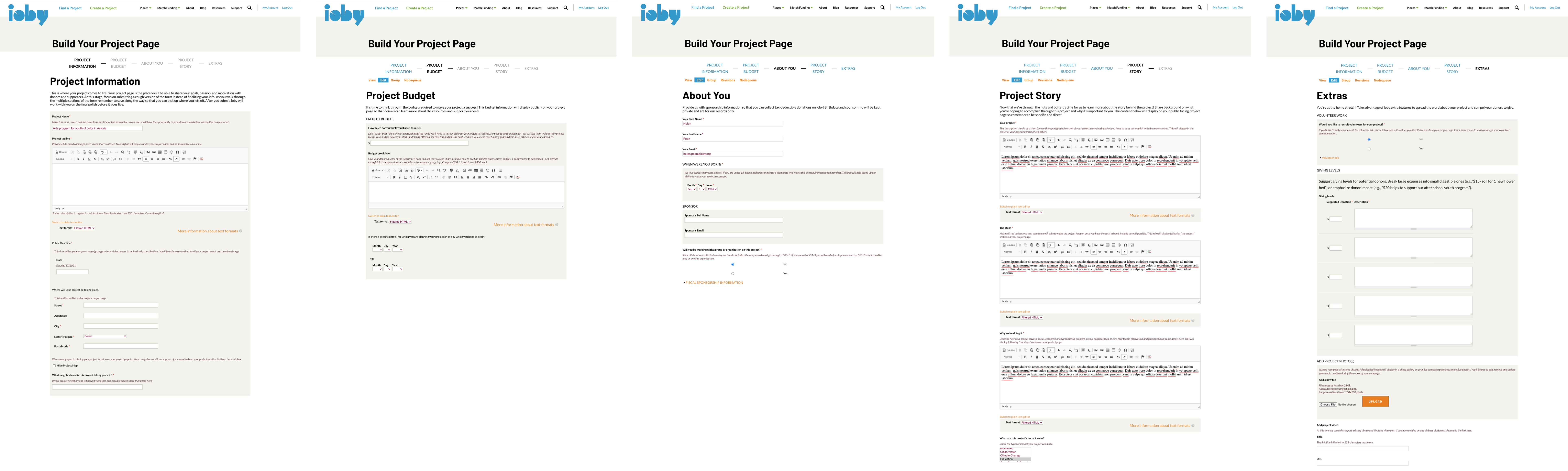
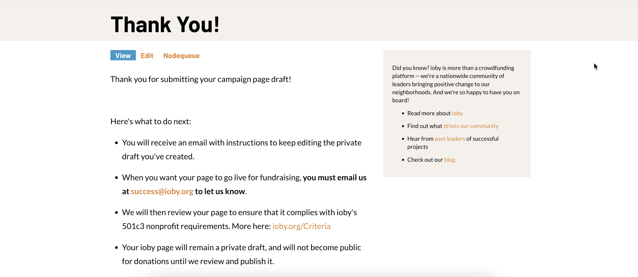
The Drupal page builder was one long form as shown above. I worked from paper sketches to wireframes to a high-fidelity prototype for the redesign, with crits and co-design sessions with the Customer Success team along the way.
ioby.org wasn’t user friendly and help text was unclear, so much of Customer Success staffs' time went to setting expectations and troubleshooting instead of coaching. A high-level checklist with step-by-step instructions was meant to take that work off their plate.
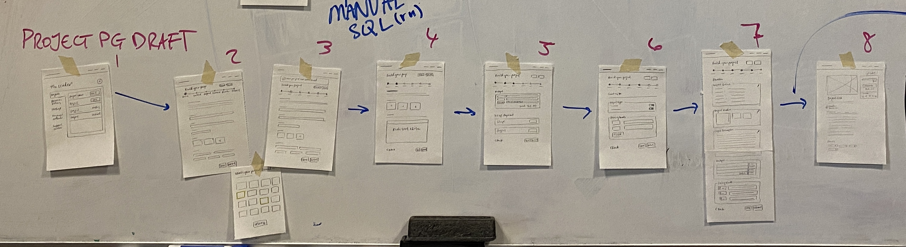
V1 · Low-fi sketches
Breaking the long form into sections
I sketched ways to group fields into sections and how a progress tracker could look, so users could get a snapshot of what still needs to be filled in at a glance.
V2 · Wireframe
A side menu of sections
The side menu was my first answer to the long form. It split the builder into steps a leader could jump between, with a check next to each finished step and a progress bar for the whole project building process. I grouped the steps by what they were for: what goes on the campaign page, optional extras, and tools to manage the project. Each step got its own screen, with help text and required fields marked, so a leader only had to think about one part at a time.
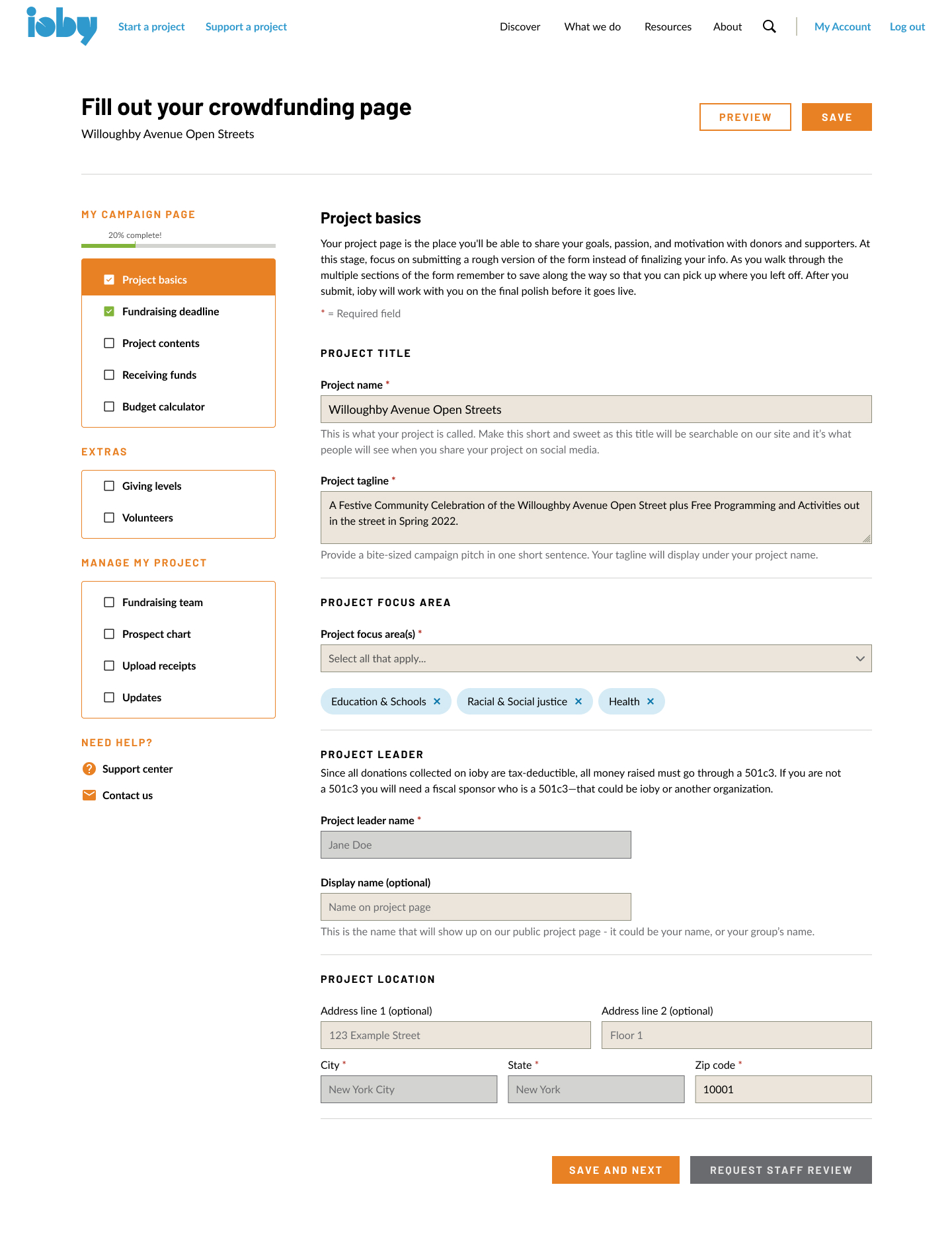
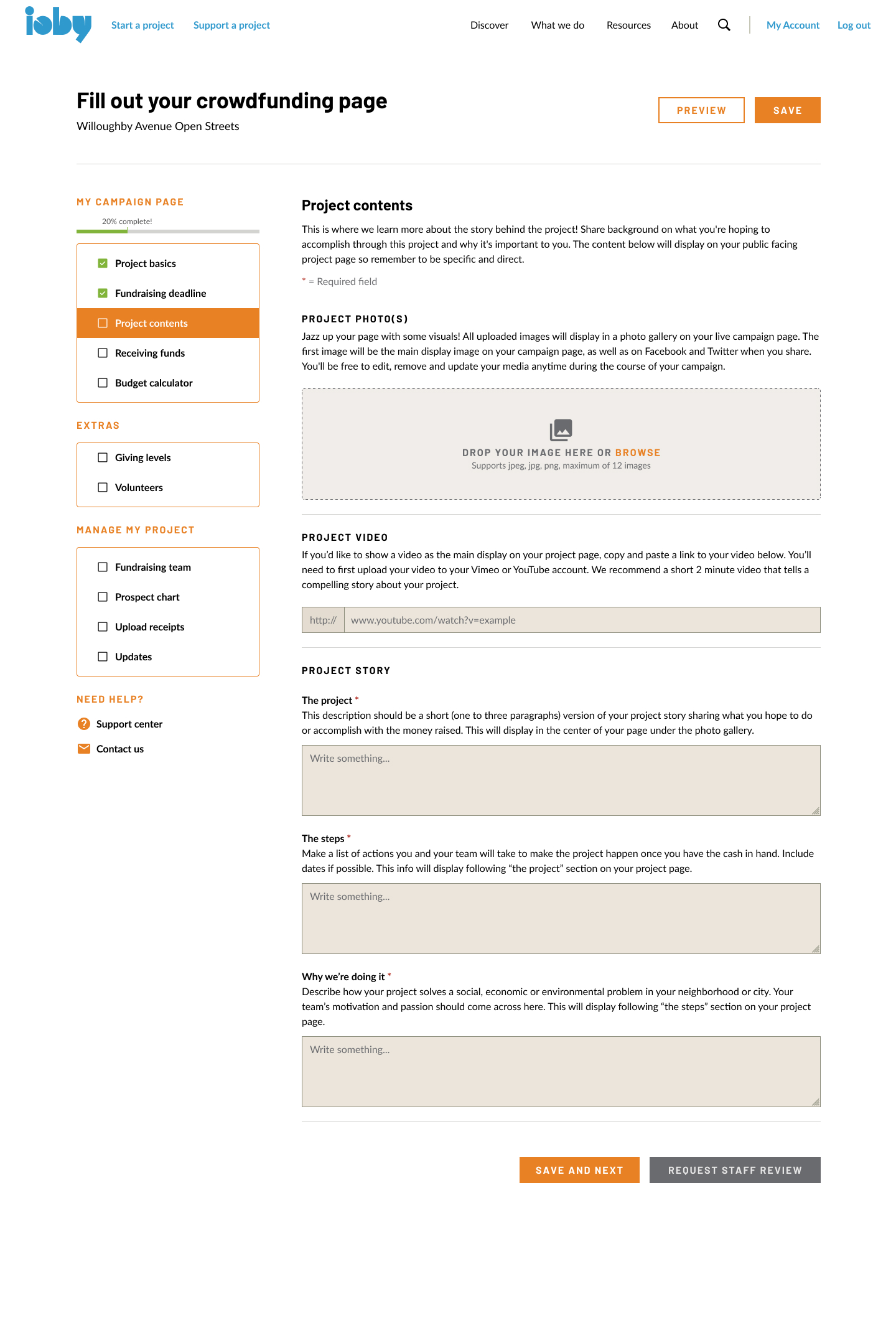
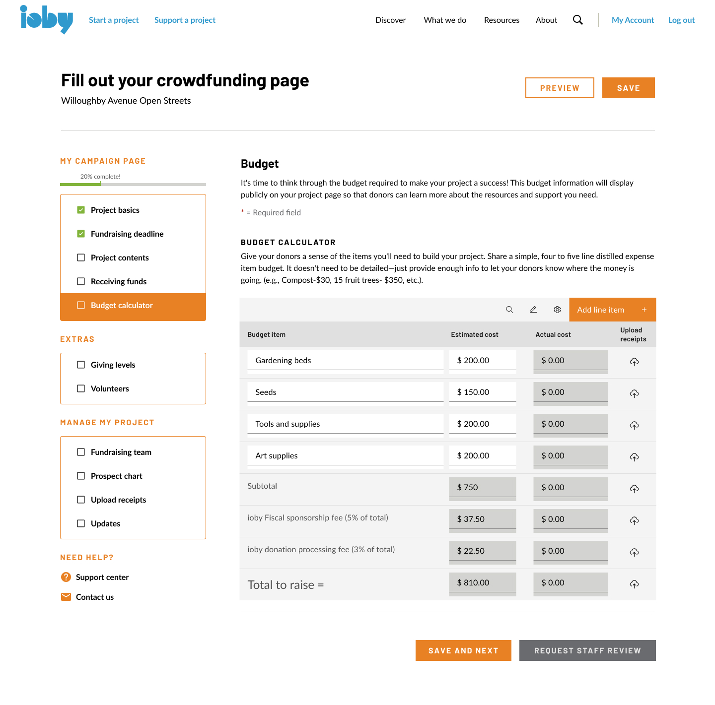
In crits, staff asked for the steps required to launch to stand out even more, so leaders in a hurry or overwhelmed could focus on just those. That feedback shaped the next version.
V3 · High-fi prototype
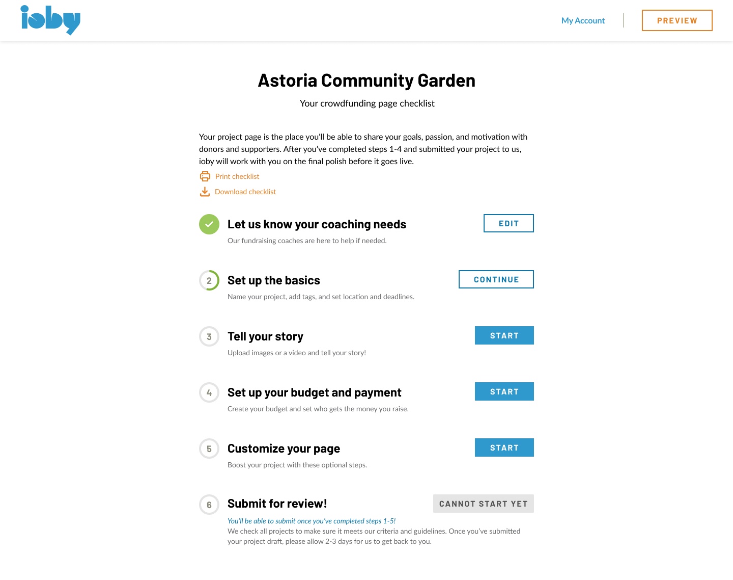
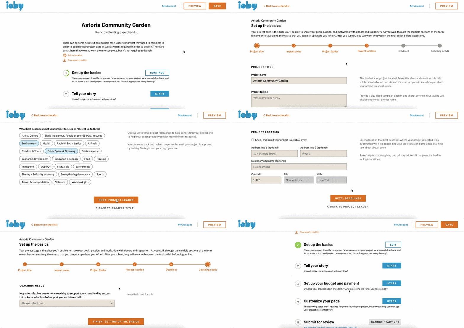
A checklist landing page
After crits and co-design sessions with Customer Success, I started to think 'less is more'. How could I make it even clearer and less overwhelming for the audience, most of whom err on the lower tech-literacy side? I made the checklist the page builder’s landing page, with five numbered sections ending in “Launch your project!”, which stays locked until the required steps are done.
“I think a progress bar will be best to push [leaders] along to complete what’s required.”
Staff liked seeing what was left at a glance, and the simpler screens left room for help text on every step.
Deep dive: fiscal sponsorship
Simplifying the most confusing part
Fiscal sponsorship let grassroots groups without 501(c)(3) status accept tax-deductible donations. It was one of ioby’s biggest strengths amongst the crowdfunding space, and its most confusing requirement.
Before
Drupal asked for a sponsor’s name and email, then “Will you be working with a group or organization on this project?” with a yes or no. The organization’s details sat in a collapsed “Fiscal sponsorship information” accordion below it. Most leaders missed this section, and Customer Success had to explain it over email or calls.
After
Asking one question: “Who will be receiving funds raised on ioby?” with help text on the side that explained ioby's fiscal sponsorship service. If the leader was already working with a 501c3 or had a sponsor, they could add those details. A leader with no sponsor would learn they may qualify for ioby’s.
The answer does more than fill a field. It sets the leader’s fees in the budget since fees depend on fiscal status, the tax paperwork Finance needs at payout, and what Customer Success says next. In testing, a longtime leader said the old site had stopped them at the fiscal sponsor questions whereas the new design, he said, just flowed.


A small trade-off
My first design required the sponsor’s name and contact before a leader could submit. That would have stalled leaders who were still finding a sponsor. Staff and I agreed to require only the answer to the question, and to add a “Not sure” option. Leaders could submit their draft without a sponsor’s details, then sort it out with their strategist before launch.
Deep dive: the budget
An auto-calculating budget table
Leaders wrote their budget in a rich-text box as bullet points, long-form text answers or a pasted spreadsheet, and staff added fees by hand. I replaced it with a table that does the math and explains ioby’s rules as the leader goes.
Key design decisions
| Part of the budget | Before, on Drupal | After, in the new platform |
|---|---|---|
| Format | Rich-text box | Two-column table of items and costs |
| Fees | Added by staff after the leader asked | Calculated from fiscal status: 8% ioby fee when ioby is the sponsor, 4% processing on every project |
| Goal | Leaders guessed what to raise | Fees sit on top, so leaders receive what they planned to spend |
| Spending rules | Explained by staff over email | Help text: every dollar goes to the project and items listed in budget must be for public benefit |
| Data | Nothing ioby could capture | ioby’s first structured budget data |
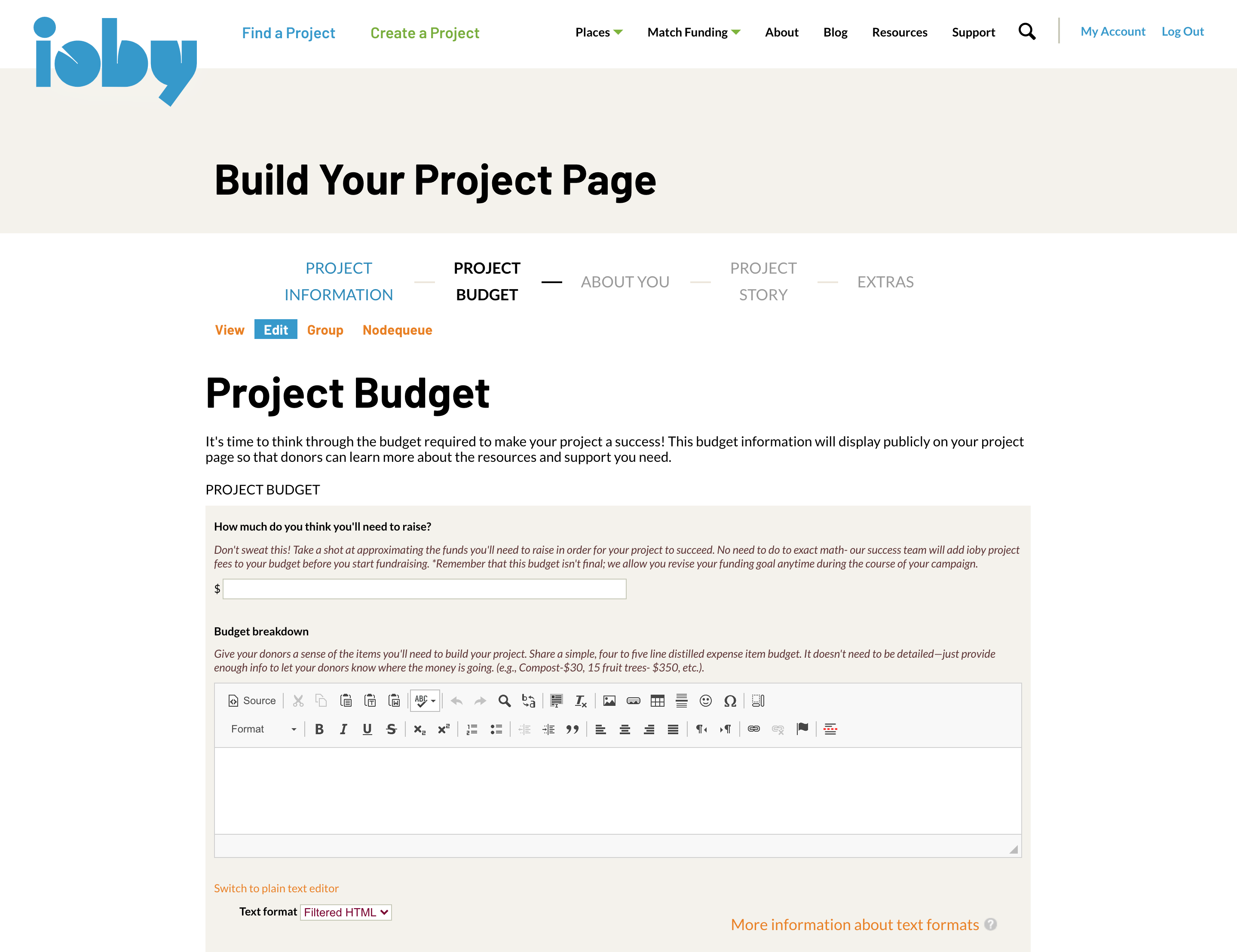

Connected to payouts. The same numbers fed the fee table Finance used to pay leaders out, which I designed in our internal tools. In testing, leaders said they liked that fees calculated on their own. One pointed out that the table accepted any number, however large, which we fixed before launch.
Launch
Tested with leaders, launched in July 2024
In May 2024, I ran usability tests with 4 longtime project leaders on the finished platform. All 4 submitted a test idea and built a draft project page without help, thinking aloud as they went. Testing also showed what to fix: leaders could skip required content, the checklist was hard to get back to, and some read 1:1 coaching as a paid service.
“Easy, straightforward experience, simple to navigate.”
Some changes could be counted as soon as staff and leaders used the new flow.
for staff to review a new idea in Retool, down from 15–45 minutes, by staff’s own estimate
staff hours saved a year on reviewing new ideas, a conservative estimate at 35–50 ideas a month
manual staff steps to take an idea to a live page
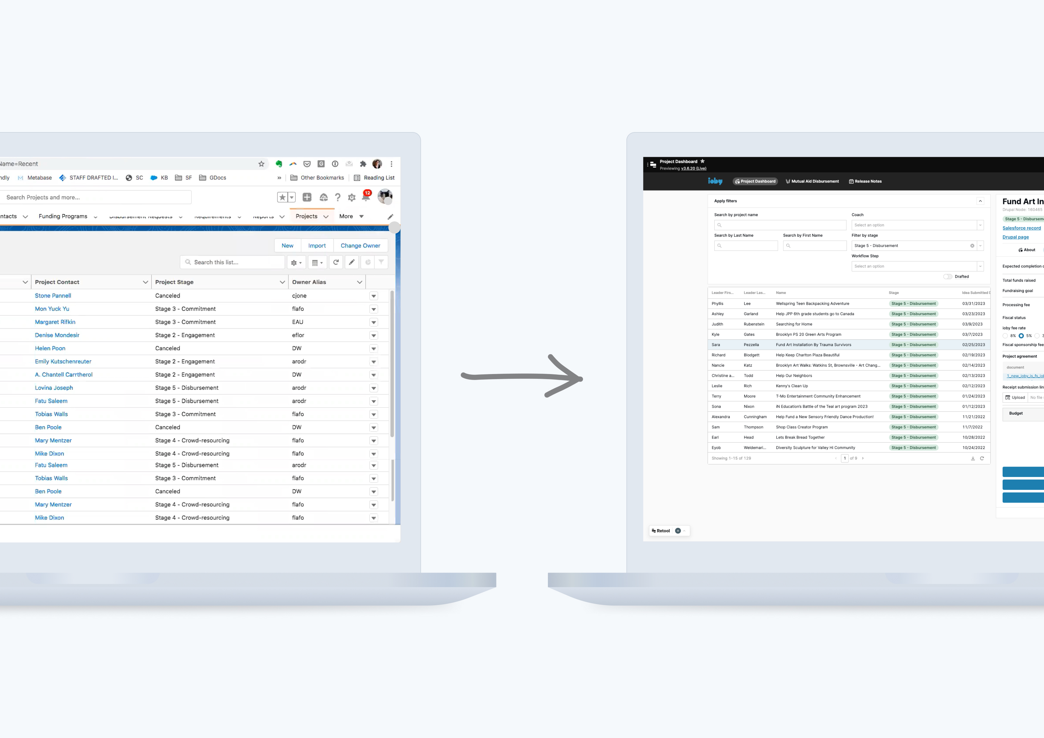
Staff went from working across six tools (Salesforce, Drupal, Slack, Sheets, The Form Assembly and Freshdesk) to two, Retool and Freshdesk. Retiring The Form Assembly also ended a separate subscription that typically costed ioby about $1,200 a year. For leaders, the idea form went from 13 questions to 9, so they could finish the first step faster. The platform launched to the public in July 2024. ioby closed that September, after 16 years, before results could be measured over time. Had ioby not sunsetted, these would have been the baselines I set to measure the rest against.
Baselines to measure against
| Measure | Baseline | Goal |
|---|---|---|
| Staff time per new leader in onboarding | 15–45 min | No more than 5–10 min per new idea |
| Conversion from idea to draft page | 9% of all ideas stalled before drafting (316 of 3,453) | Track conversion from onboarding to page building, with timestamps and time on task |
| Where leaders quit the builder | No data | Drop-off by section |
| Duplicate and spam ideas | 2–3 spam ideas a week | Fewer of both |
Other projects
Since the nature of a redesign and migration from 0-1 is extensive and difficult to capture in one case study, core parts of the design process outside of the onboarding and crowdfunding platform were omitted from this page, including:
- A Figma component library for our engineers
- the marketing site and sitemap with our CMO
- a new checkout with recurring donations
- sign-up, log-in and account dashboards
- a workflow for reconciling receipts, which ioby previously did not have
- ioby’s digital inclusion policy committing to WCAG AA
Reflection
Navigating a full platform overhaul
This was the biggest change to ioby’s product since it began, built by a small team under real constraints. Three challenges shaped how I worked.
Working inside parity
Holding to feature parity was harder than it sounds: staff and I both had long wish lists, and it would have been easy to change how the site looked without changing how it worked. Looking back, the constraint helped. With nothing new to add, every change had to make an existing question easier to answer.
What I did
- Treated parity as a rule about data, not design: the same fields in, asked in a better order and with better words
- Spent the design time where leaders struggled most: fiscal sponsorship and the budget
- Kept bigger ideas, like leaders publishing their own pages or match program management, for after the first release
Balancing competing stakeholder demands
Every team leaned on the page builder. Strategists wanted the idea form to qualify every lead, the Match team wanted eligibility checks and applications built into the builder, and an organization-wide goal called for expanded fiscal sponsorship in the first release. Each request made sense for that team, and together they would have made the first step harder for leaders.
What I did
- Ran co-design workshops with each team, so trade-offs were made in the room instead of in review
- Asked one question of every request: could we get this later, in drafting or in a conversation?
- Pushed expanded fiscal sponsorship out of the MVP, and kept the idea form short with a “Why we ask” note on each personal question
The only designer on a small team
I was the product owner and sole designer, working daily with one senior engineer and our CTO. There was no one else to hand requirements, design QA or research to, and I was learning how a nonprofit’s Customer Success and Finance teams worked as I went.
What I did
- Wrote the requirements for the idea form and page builder myself, so scope and design stayed in one place
- Built a component library in Figma so our engineers could build from shared parts
- Shadowed Customer Success staff and turned usability test findings into user stories for our engineer
Staff feedback on the new platform was very positive. The part I’d carry into any team is the habit behind all three: make the trade-off visible, and decide it with the people it affects.