Problem
Making insurance easier to understand
Problem
Insurance is a convoluted topic, and Kaus is losing ground with young consumers because its online services aren’t user-friendly.
Objective
Design an easy-to-use, direct-to-consumer online experience that appeals to younger consumers, and develop a modern visual identity for Kaus.
Research and insights
Understanding the insurance market
As someone who knows how frustrating and convoluted insurance can be, I needed research to identify the strengths of the existing insurance market, the improvements that could be made, and the insurance needs of younger consumers.
Competitive analysis
A quick competitive analysis of insurance companies (Oscar, State Farm, Progressive, Allstate, and MetLife) showed:
- Insurance sites are loaded with information, which can be overwhelming
- The main call to action is typically to get a quote
- Most insurance companies highlight home, auto, and life insurance. Health insurance is featured less, as some companies focus specifically on healthcare
Oscar
Strengths
- Simple navigation and language
- Easy steps to get a quote
- Great UI: very friendly and uncluttered for a younger audience
- Easy-to-follow explanation of plans
Weaknesses
- Only focuses on health
- Services only in the US
- Perhaps oversimplified, and lacks critical functionality
State Farm
Strengths
- Wide range of insurance options, including discounts
- Vast amount of resources for customers to learn more
- Option to find a local agent in the US
Weaknesses
- Services only in the US
- Online quotes not widely available
- Focused more on finances
Progressive
Strengths
- Very user-friendly UI, with information and CTAs laid out clearly
- Offers discounts and bundles
- Good, personable branding
- Has an online chat system
Weaknesses
- Overwhelming number of options
- Inconsistencies in the UI (e.g. the chatbot)
- Outsources to third-party providers, some of which are unavailable
Allstate
Strengths
- Customizable bundle options
- Provides resources, including local agents you can contact
Weaknesses
- Antiquated UI, not a good fit for a young target audience
- Blurry imagery
- Not as comprehensive as other insurance sites
MetLife
Strengths
- Provides business and broker insurance options
- Nice, neutral UI
- International services
- Has bundle options
Weaknesses
- Not customizable
- Need to call to get a quote; difficult online experience
- Slightly antiquated UI
Interviewing potential users
I also interviewed five participants, all in their mid-20s except one, who is in his 30s and married with children. The main takeaways from the interviews were:
- There is a general attitude of indifference towards insurance
- Insurance is confusing and costly
- Users value speed
- Users want to do things online, as processing in person is inconvenient, and want online services that work, stay up to date, and offer comprehensive information in one place
- People employed by a company usually get health insurance through work benefits, and don’t see a need for insurance beyond that
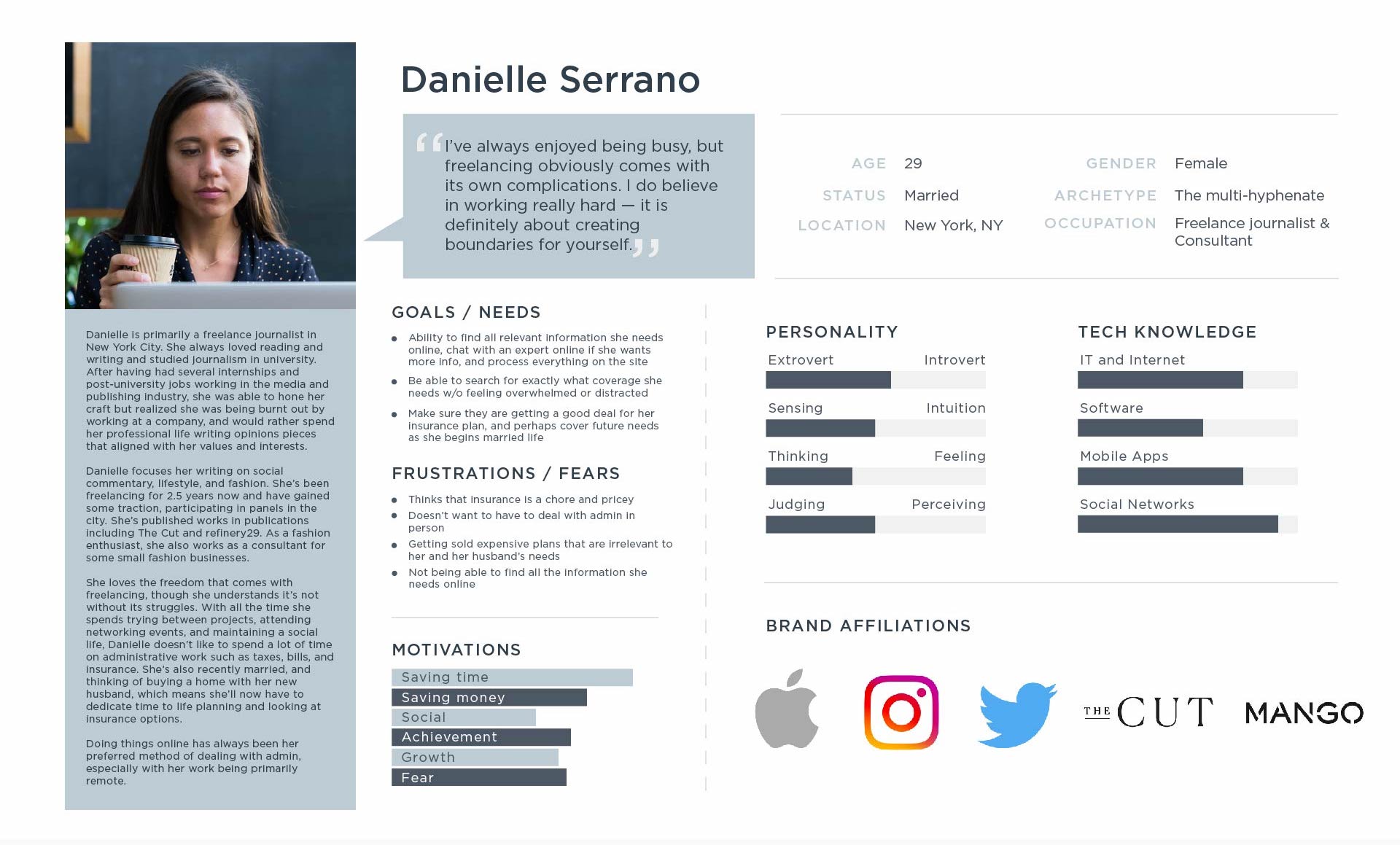
Since most of the people I interviewed, apart from the older participant, didn’t think much about insurance, I considered the kind of user who might worry about it more. This led to the idea of designing for freelancers who aren’t insured through a company, and who have more assets that need insurance beyond health.
Define
Defining the user journey
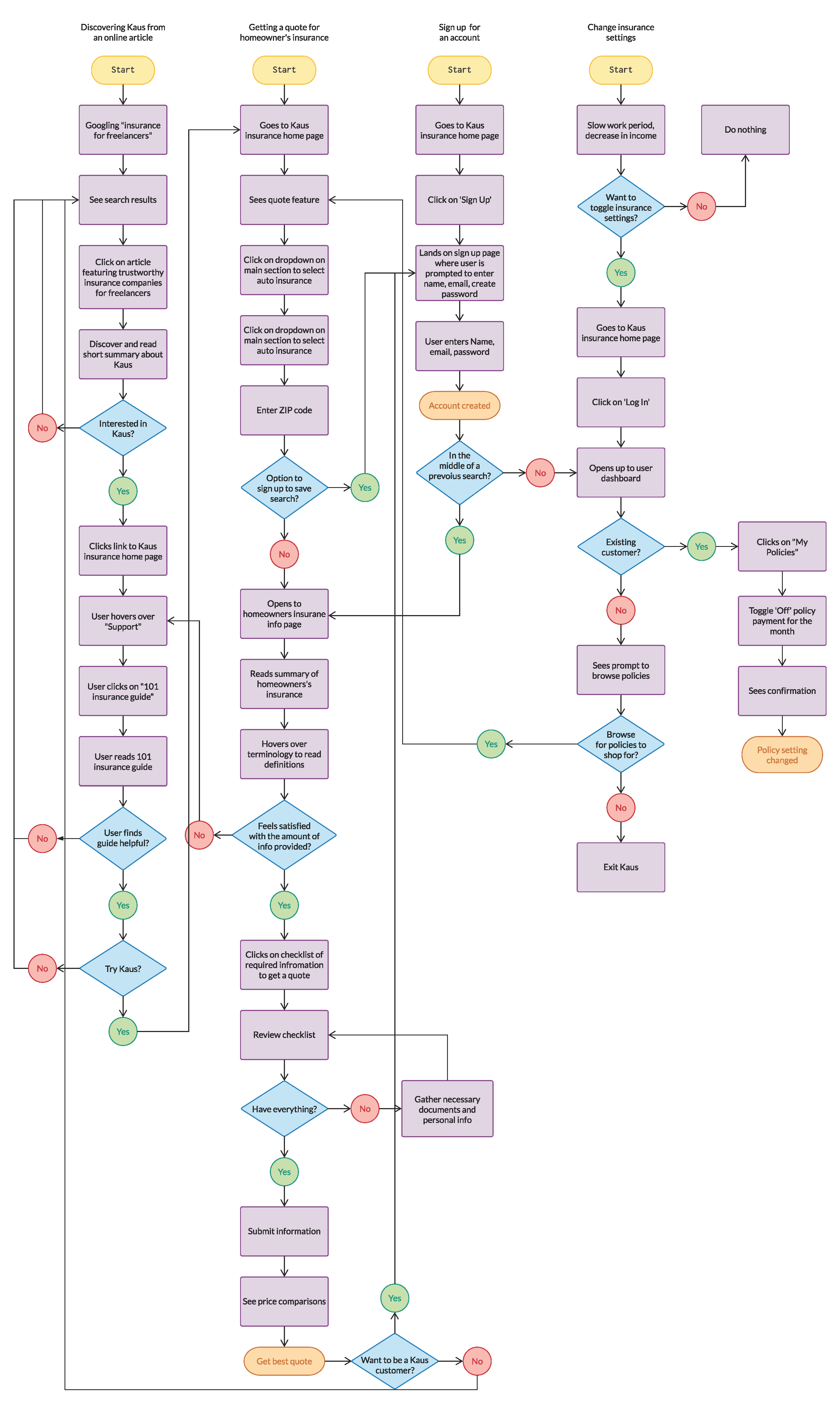
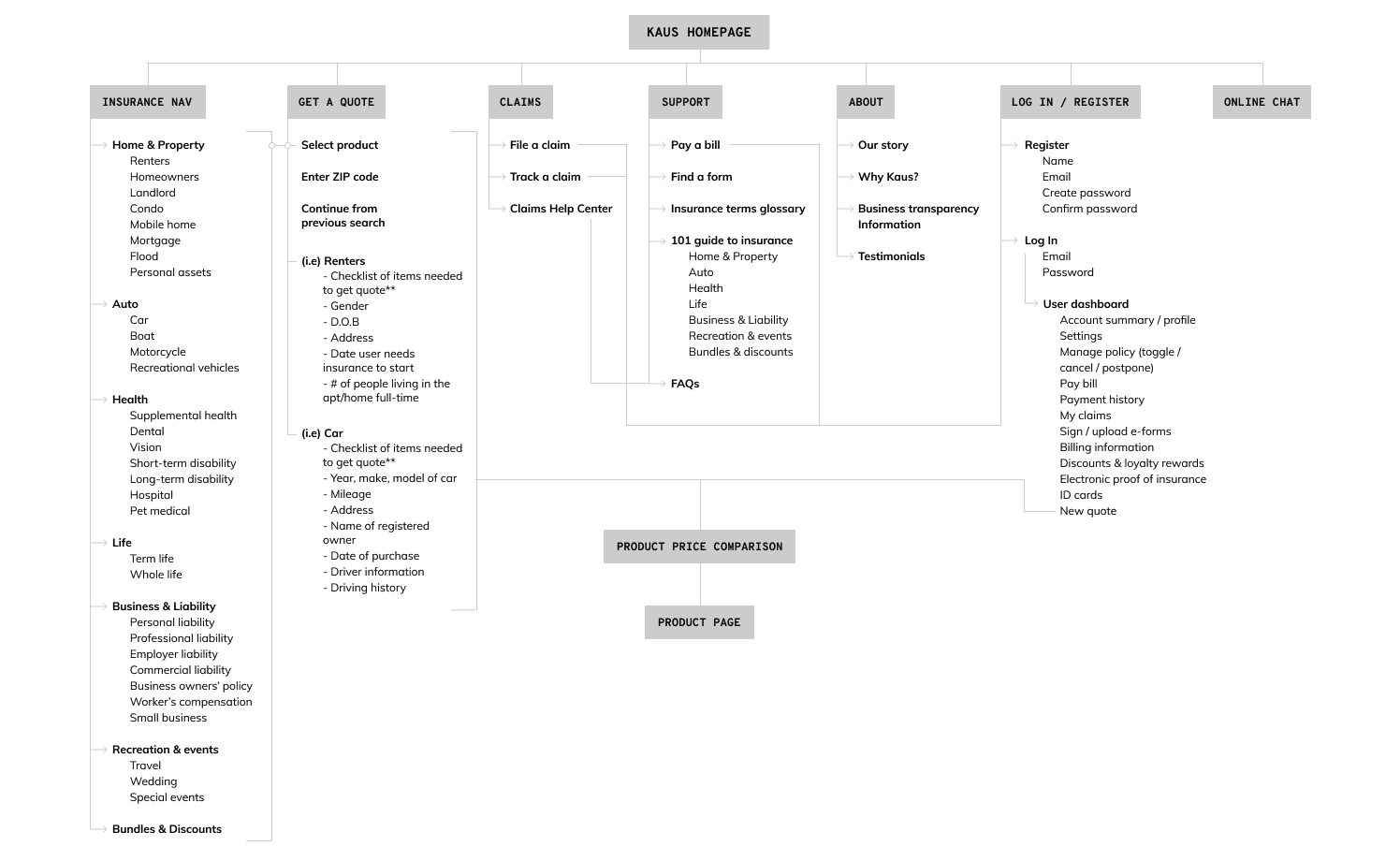
I mapped out a user flow to gauge how users might interact with the website. The flow covers the four main tasks I found on competitor sites:
- Learning about the company and about insurance
- Getting an insurance quote
- Signing up for an account
- Changing insurance settings (existing users)
Brand identity
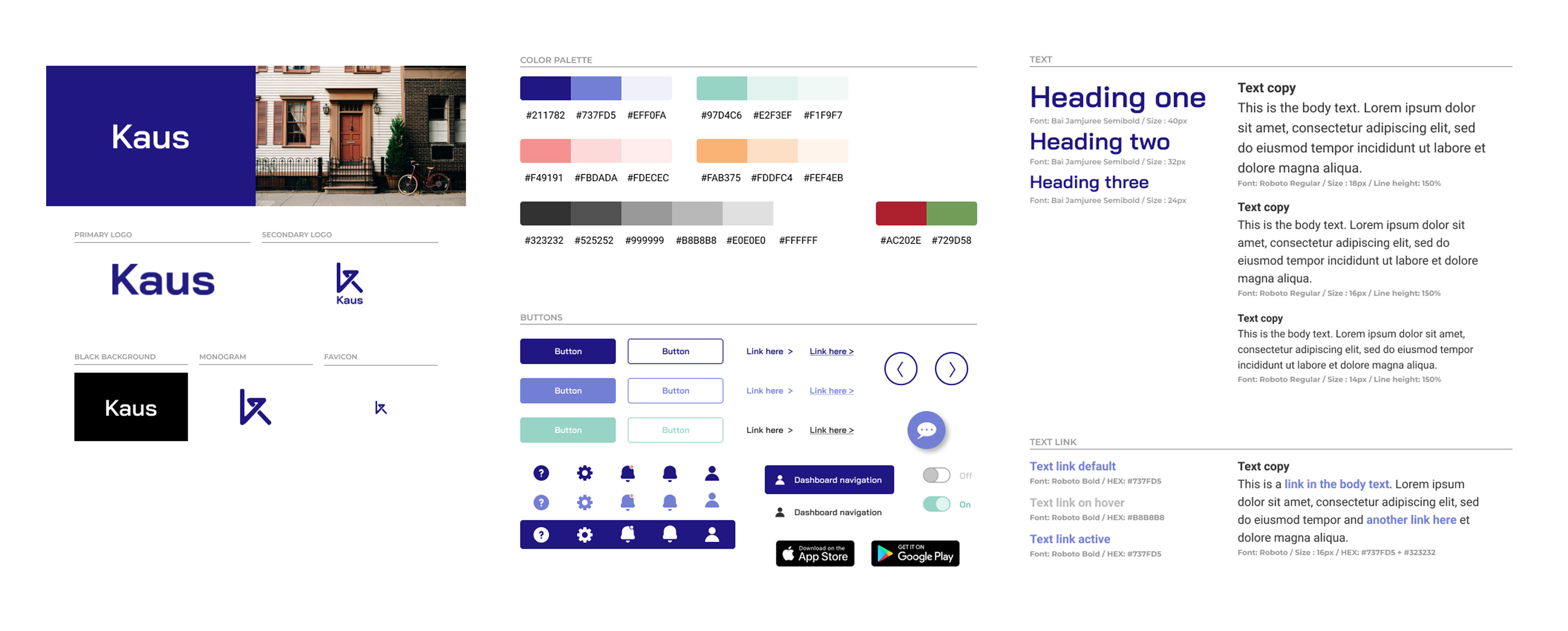
Creating a friendly and visually appealing brand identity
Research showed that younger consumers want a more user-friendly way to buy insurance. Kaus’s message therefore centers on efficiency, clarity, speed, and friendliness: values that are familiar and desirable to younger users. I drew inspiration from sites like Oscar, which succeeded by making something complicated easy to understand and by using data to streamline processes and choices.
Testing and iterations
Testing and refining for clarity and trust
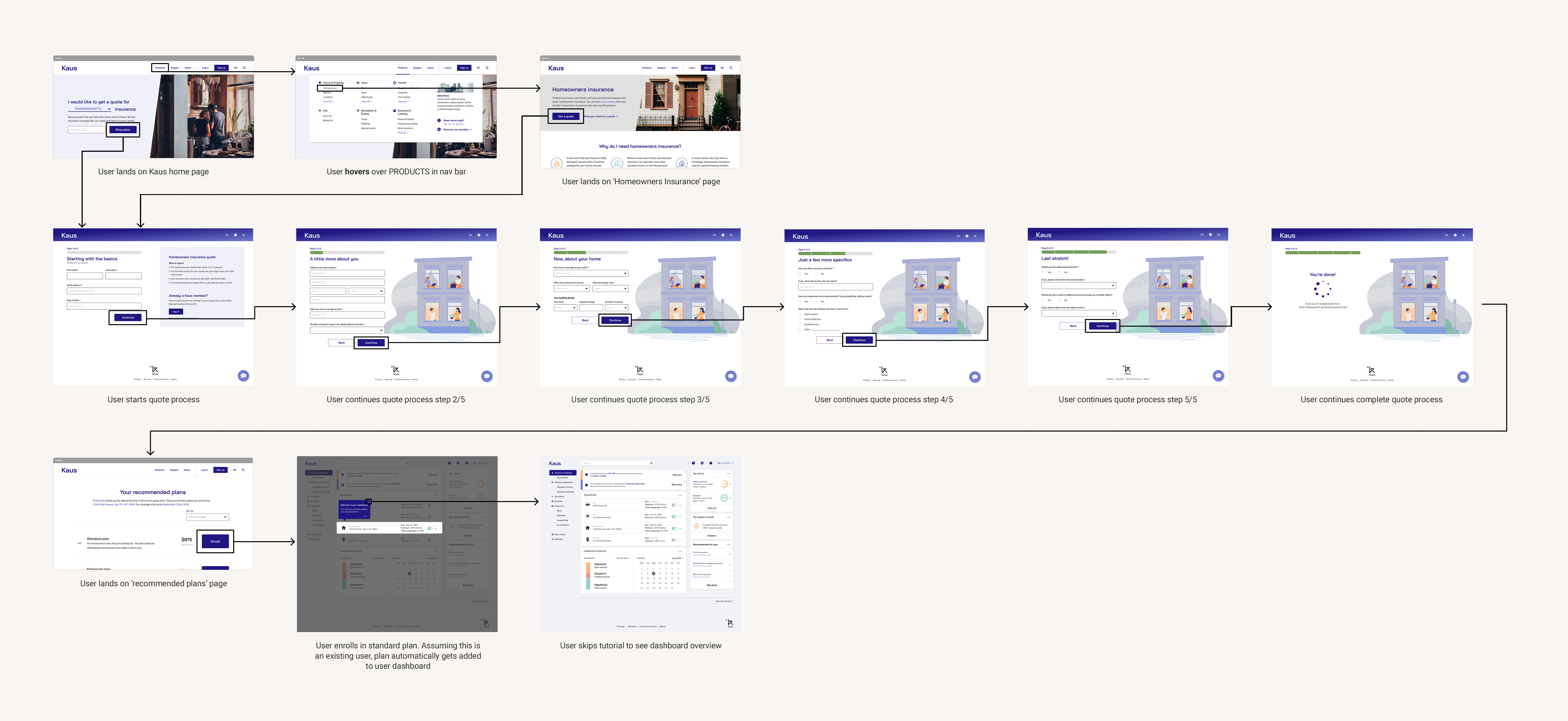
With the visual style in place, I created a mid-fidelity prototype with one main task: get a homeowners insurance quote and enroll in the cheapest plan. To see how users responded to the dashboard as well, the flow assumes they are existing Kaus customers.
Designing a dashboard for freelancers
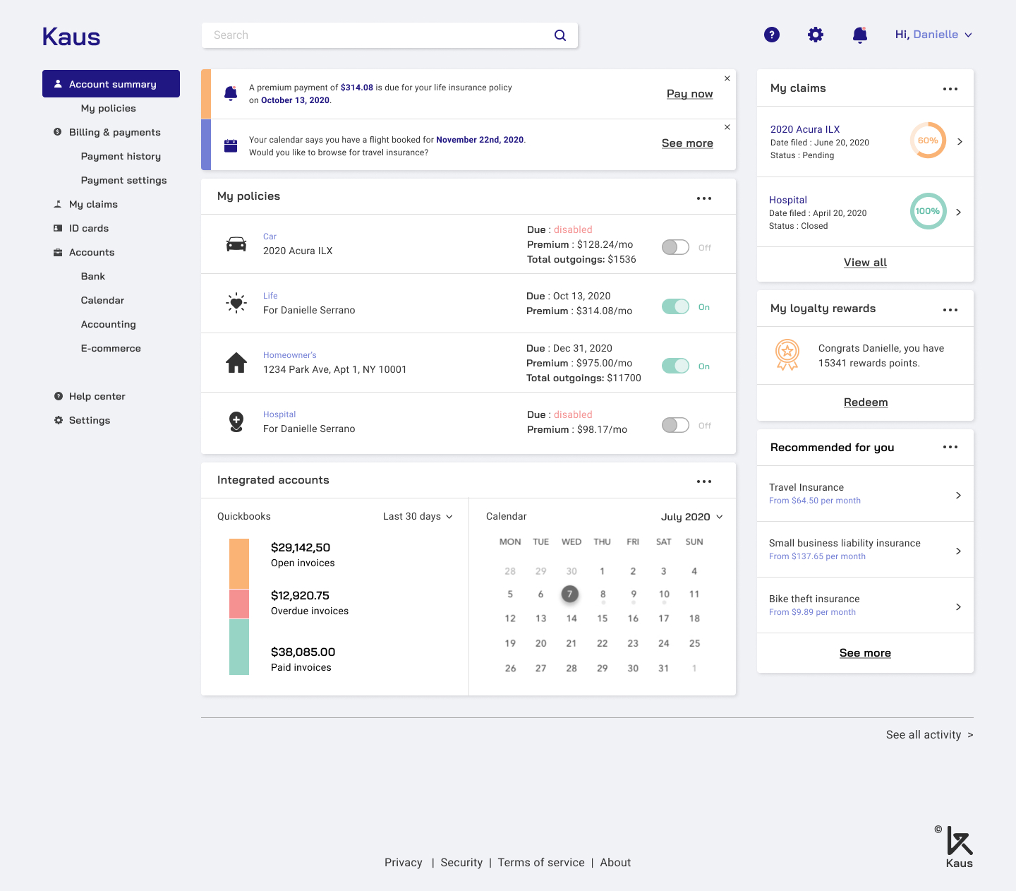
The dashboard mattered because freelancers typically handle their own admin. I designed it after researching accounting software like QuickBooks and WordPress management tools, to understand the design patterns freelancers may already know. For ease of use, users can connect other accounts, like their calendar or accounting software, so Kaus becomes a more all-in-one insurance management system.
Usability testing with five participants
Using this mid-fidelity prototype, I ran usability tests with five participants. Each was asked to get a homeowners insurance quote and enroll in the standard plan. There were several paths: users could get a quote directly from the home page, or go to the homeowners insurance page to learn more first. I grouped the common comments about what worked and what could be improved in an affinity map:
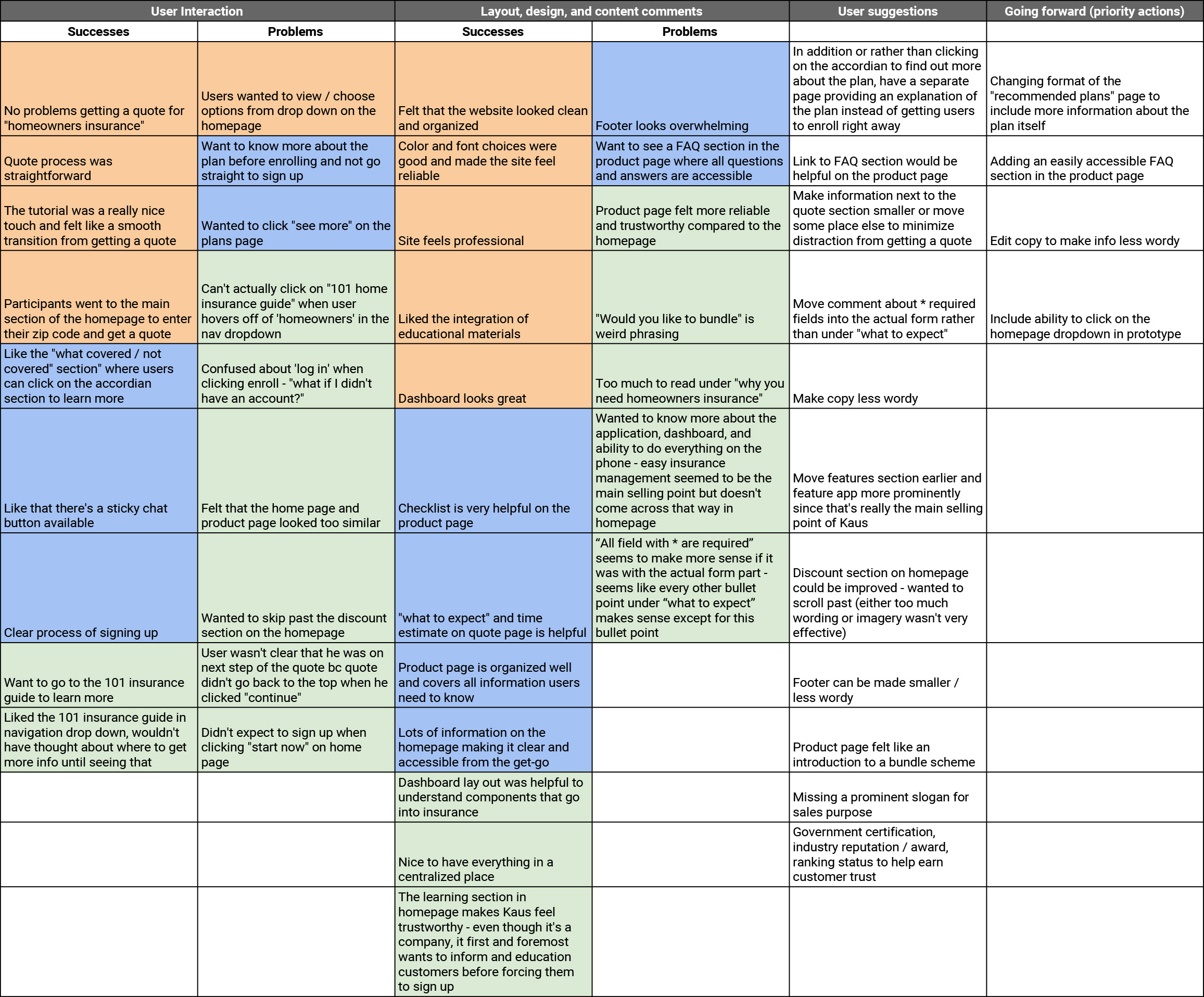
Participants knew insurance is important, if convoluted, and wanted to read more about the plan before enrolling and paying. That meant adding a page to the flow where users can read about the standard plan. With this in mind, I iterated on the design:

Final design
The final prototype
Findings and takeaways
What I found and learned
The lack of clarity in the insurance market makes the topic confusing for many people, and being able to find information online is a necessity for younger consumers. A more fully fleshed-out high-fidelity prototype would allow further testing and refinement.
Because insurance is so specific and each type needs a wide range of information, improvements to the copy and content should be prioritized with experts in the field.
Takeaways
This was my first project applying the UX research and design techniques I learned in Designlab’s UX Academy. A few key takeaways:
A cohesive visual system matters
Even for an insurance website, typically seen as fairly mundane compared with e-commerce sites, a cohesive visual system was incredibly important for creating a style that appeals to a large group of younger consumers.
User research puts the whole project in context
It’s easy to approach design through your own visual lens, but interviewing even a few potential users really helped clarify the language to use and the features to include. The challenge was finding the right users, since my persona was a freelancer. Due to time and pandemic constraints, the research was a little limited.
Copy can make or break the experience
I took on a challenging project, knowing very little about insurance. For a topic this specific, content and wording help show a brand’s personality and what it offers. As someone who isn’t a skilled copywriter, writing the copy was a real challenge and needed lots of secondary research.