Role
Product Owner
Lead Product Designer
Duration
Jun 2021 - Jul 2024
Contribution
Product management, product definition, UX research, UI/UX design, user flows, visual design, prototyping, usability testing
ioby, which stood for “in our backyards”, was a crowdfunding platform that gave local community leaders across the US the ability to crowdfund for community-based, public-benefit projects to make their neighborhoods healthier and more sustainable.
ioby was hosted on Drupal 7, which was showing its age, and needed to migrate to a more modern tech stack. The crowdfunding product needed to be rebuilt and one of the most important features was the project page builder that ioby’s core users, the project leaders, interacted with the most.
A project page builder built separate from Drupal. Since ioby was simultaneously working on an internal tool and data migration, the page builder should have feature parity with the Drupal project page builder to accommodate migration, but with new and improved user experience based on 5+ years of user feedback.
Note: To read about my work on ioby's internal tool, click
here.
The project page builder was limited by the Drupal CMS, which wasn't built for the crowdfunding functionality that ioby needed. The Drupal page builder also looked outdated, like "it was stuck in 2012", as a research participant put it.
We wanted to create a project page builder on a new tech stack. However, a big part of this redesign was not as simple as building a new product, we also needed to prioritize migration on the backend. Our plan was to engage in a long-term phased strategy starting with building a solid foundation and a sustainable internal infrastructure.
What this meant for the external facing product was that we wanted to keep deliverables light and avoid spending time adding new features.
The focus was on creating an MVP of the project page builder that had parity with Drupal. Given that we were building the crowdfunding product on a new tech stack, we had liberty to improve the UX, especially given that the core product was not complicated - the project page builder was a long form.
What mattered was how the questions were presented and how we collected the data. For this reason, we took this as an opportunity to make simple but high impact improvements to the user experience that addressed years of user feedback without compromising backend data collection and migration.
Important Note: This page focuses on
the external customer-facing product. To read about my work on the internal staff-facing product, click
here.
Six months after I was hired on as a Product Designer, it became clear that the organization needed a product lead. I conducted user research between July 2021 and Dec 2021, presented the product vision to senior management, wrote user stories, worked with two engineers, and co-designed the internal and external products with staff members in 2022, participated in the hiring and onboarding of a new CTO in January 2023, onboarded staff to the new internal product in early 2024 and launched the new crowdfunding platform to the public in July 2024.
Given that I was the first in-house product person ioby has hired, the first thing I did was conduct a heuristic analysis to get a sense of ioby’s product. I went through some must-have pages on
ioby.org (Home, about, blog, resources fiscal sponsorship, project list, project page, donation flow, intake/idea form).
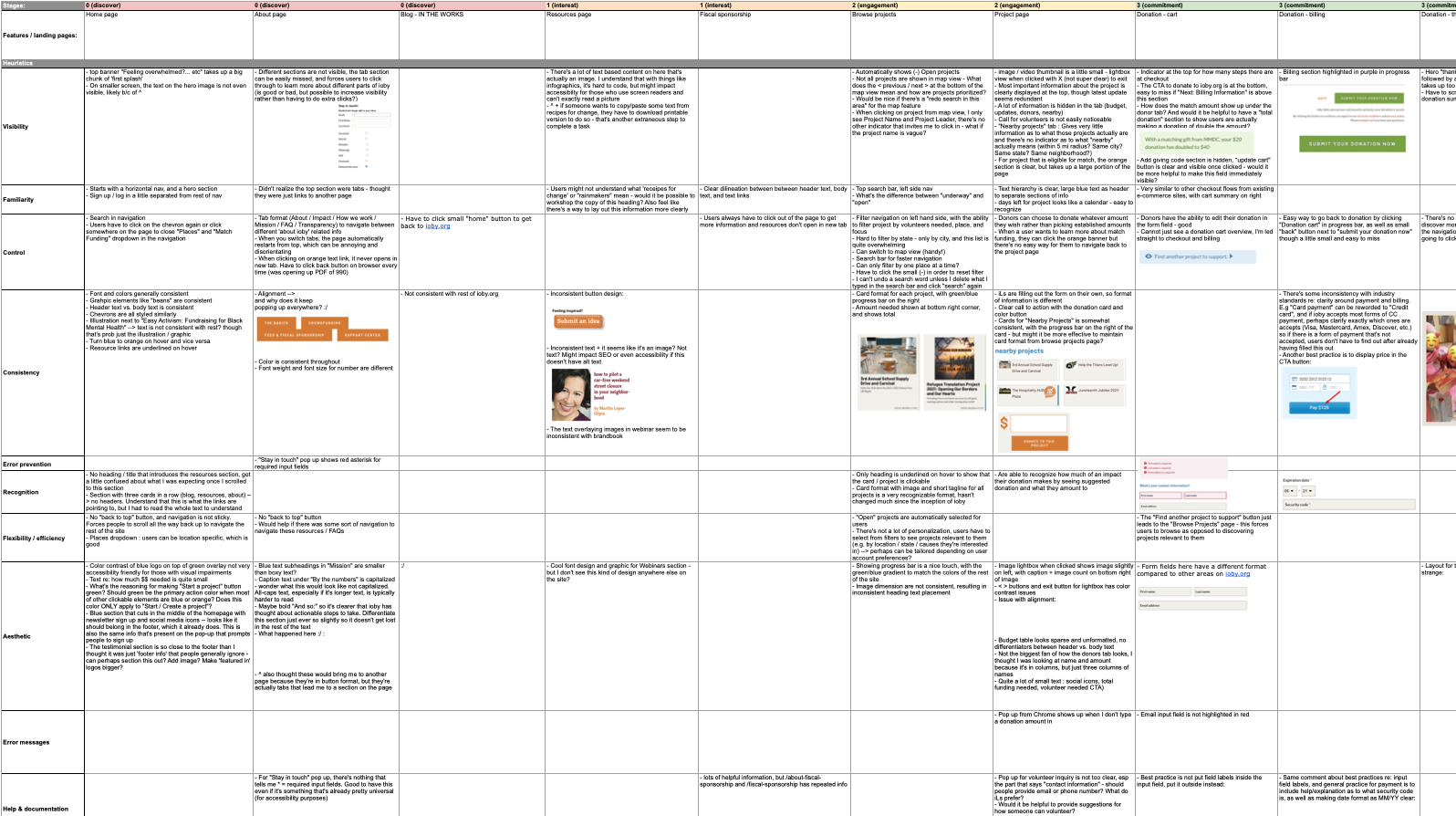
High level learnings from this evaluation included:
- There were many inconsistencies in aesthetics and visual hierarchy
- The site lacked accessibility
- Navigation was disorganized
- The site was very text heavy
- Important pages that talked about ioby's features and processes were hard to find
- There was poor discoverability with filters being difficult to use
- There was lack of information clarity at the 'commitment' stage
I started with looking at the most mainstream crowdfunding platforms on the market such as GoFundMe and Kickstarter to get a sense of the common features of a crowdfunding website. While talking with members of staff and senior management, I gathered insight on who our direct competitors were, which included similar nonprofits and B-corp civic tech platforms like Classy, Kiva, GiveLively, and others.
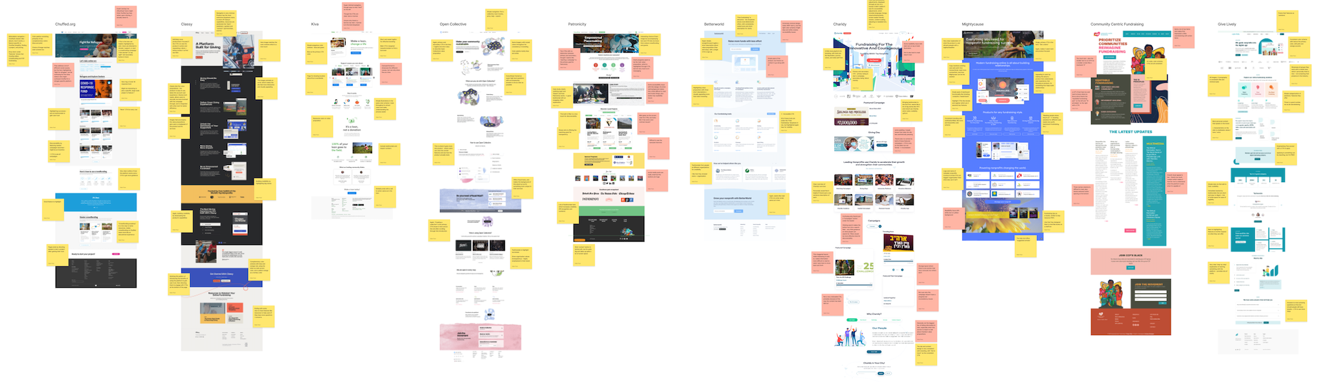
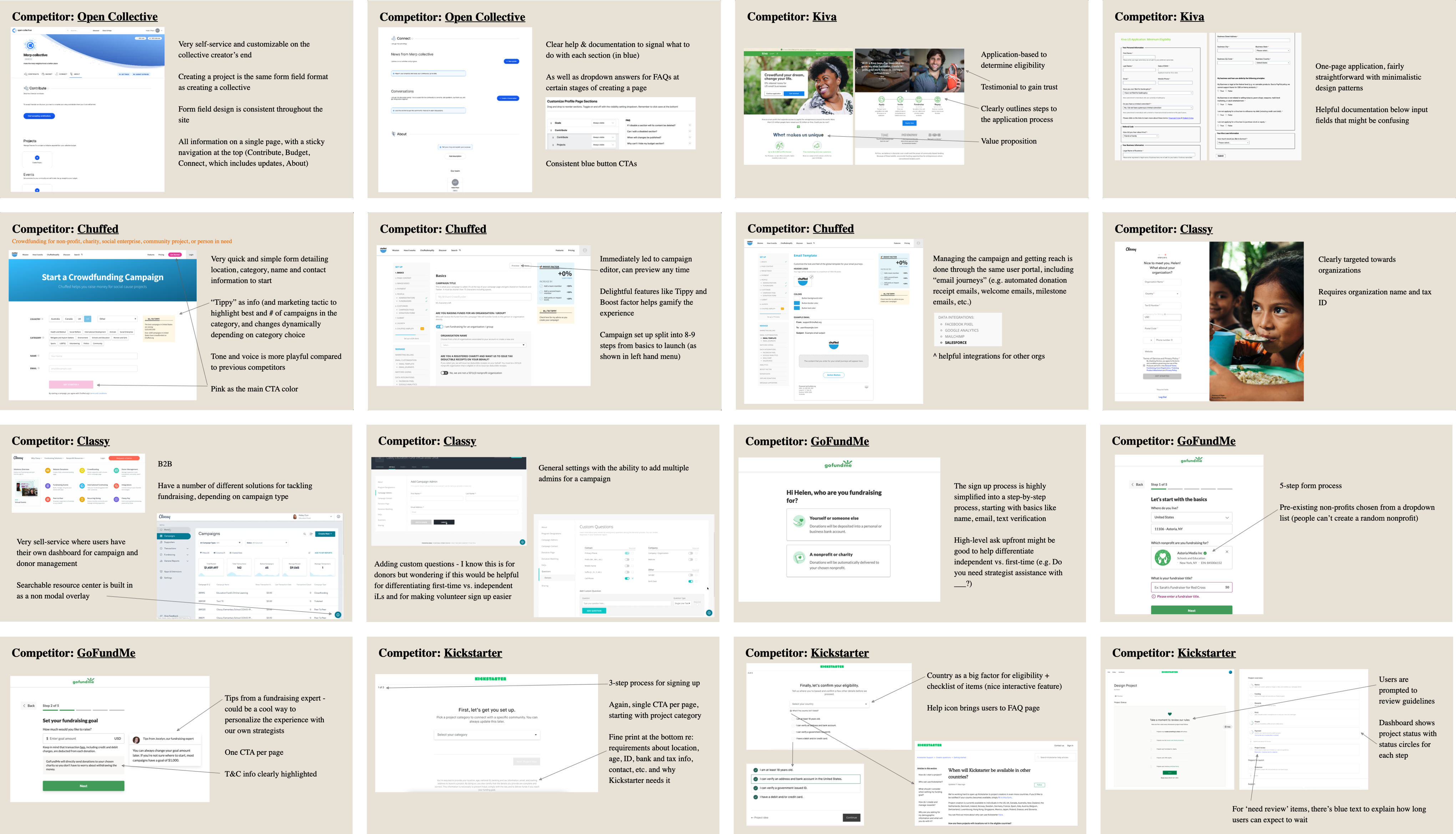
I noted all the features these crowdfunding platforms (CFPs) offered and put together a Google sheet showing ioby's position among other CFPs to highlight ioby's uniques:
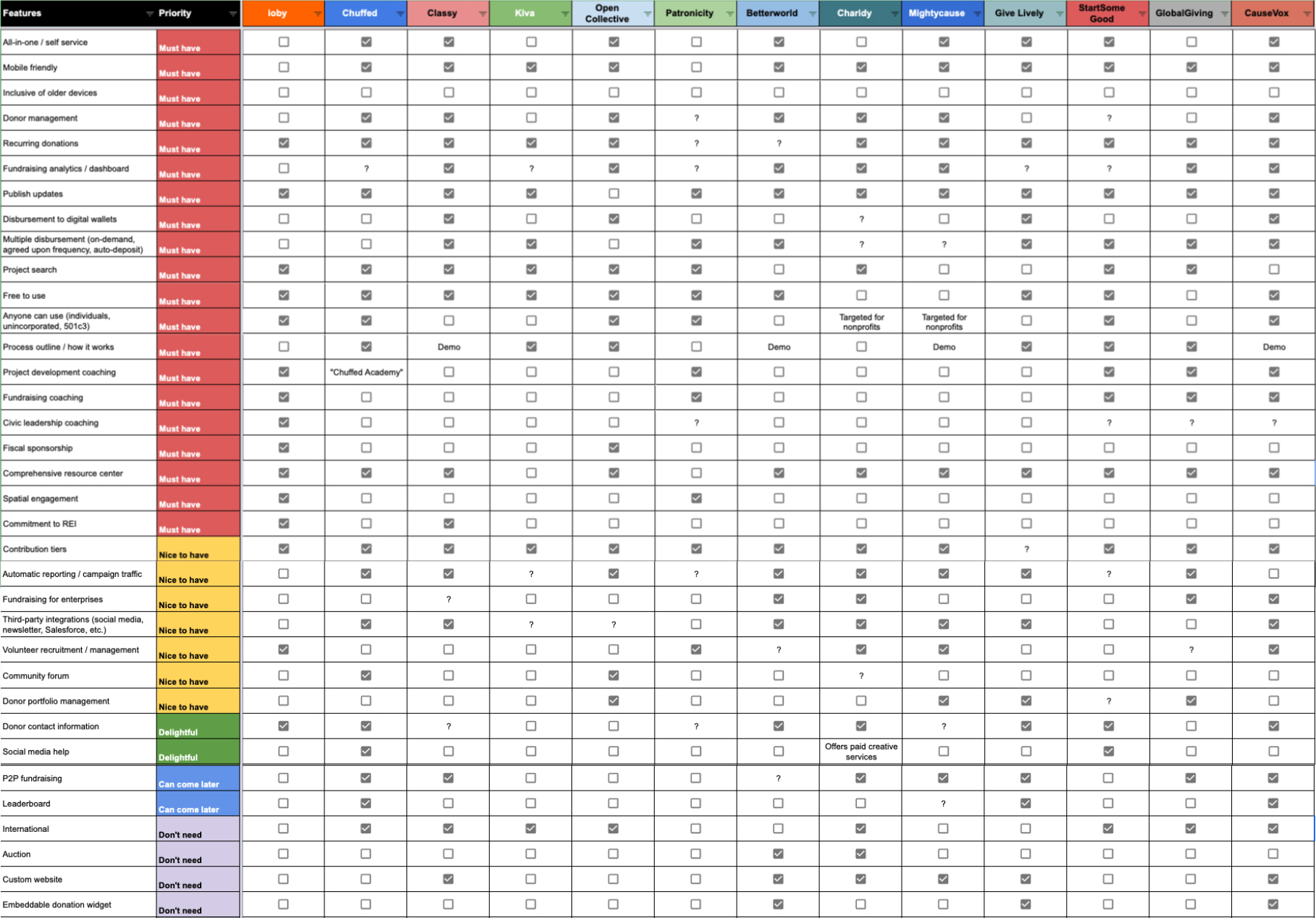
Where ioby was uniquely strong compared to others:
- Providing 1:1 project development, fundraising, and civic leadership coaching
- Offering 501c3 fiscal sponsorship
- Offering match grants through ioby's partnerships
These three uniques paralleled what users were saying they valued most from working with ioby.
There were no processes in place for conducting user research when I joined, so I created basic guidelines for how to build a research plan, pre-research questions to be answered, how to recruit participants to ensure diverse representation within ioby’s research practices, best practices for interviewing, and other UX research methods + tools. This was especially important for an organization that prioritized equity and inclusion and aimed to uplift those who have been historically marginalized.
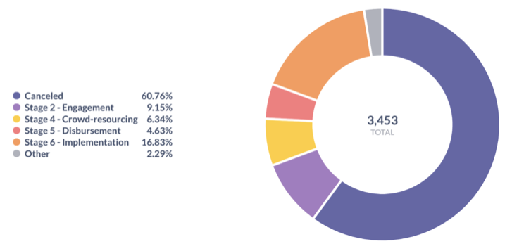
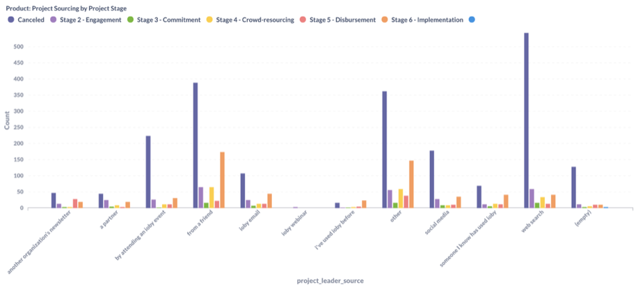
Using the guideline, I first pulled pre-research data like demographics, net promoter score (NPS), sourcing, drop rate, engagement, etc. and noticed the following:
- Most projects are baed in NY, OH, TN, PA, MI, and CT
- About 25% of projects are deemed acceptable (projects in stage 4+), though this number is misleading due to spam submissions
- Greatest success rate of project completion are those who learned about ioby through a friend
- High cancellation rate from those who found ioby through web search - assumption here being that people who haven't heard about ioby before had trouble figuring out what ioby did and decided to not move forward
- Repeat feedback about more automation to thank donors
- Multiple comments about the product not being mobile responsive
- Users wanted more help with social media through coaching or integrations
- Users loved coaching
- Many users noting the lack of clarity around how everything at ioby worked
- Hesitancy around ioby's lack of brand recognition and visibility in the CFP world
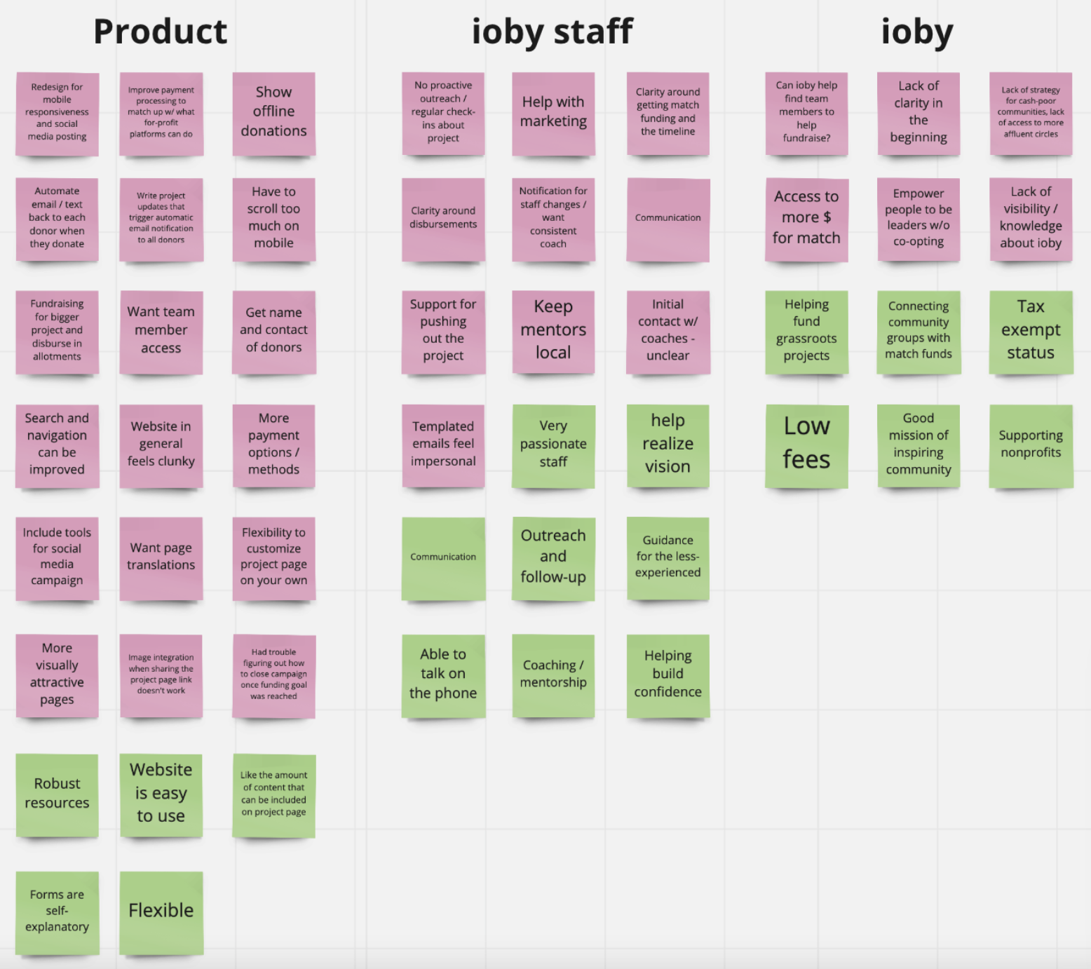
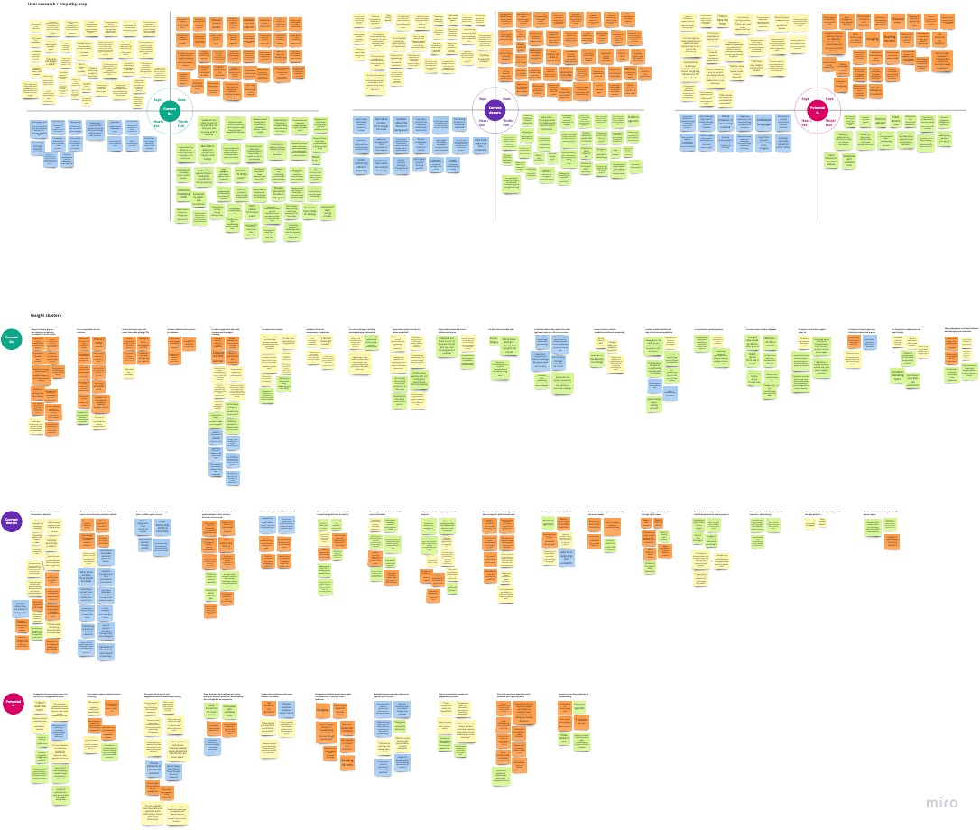
While many of our users provided some detailed qualitative feedback in the NPS surveys, it was still important to speak with our users to fill knowledge gaps. I spoke with 17 users - 6 of whom are project leaders, 8 of whom are project donors, 3 of whom were potential users (community leaders who have not used ioby) and organized insights into empathy maps and repeated feedback.
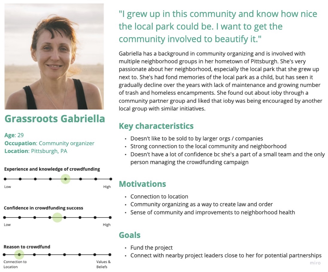
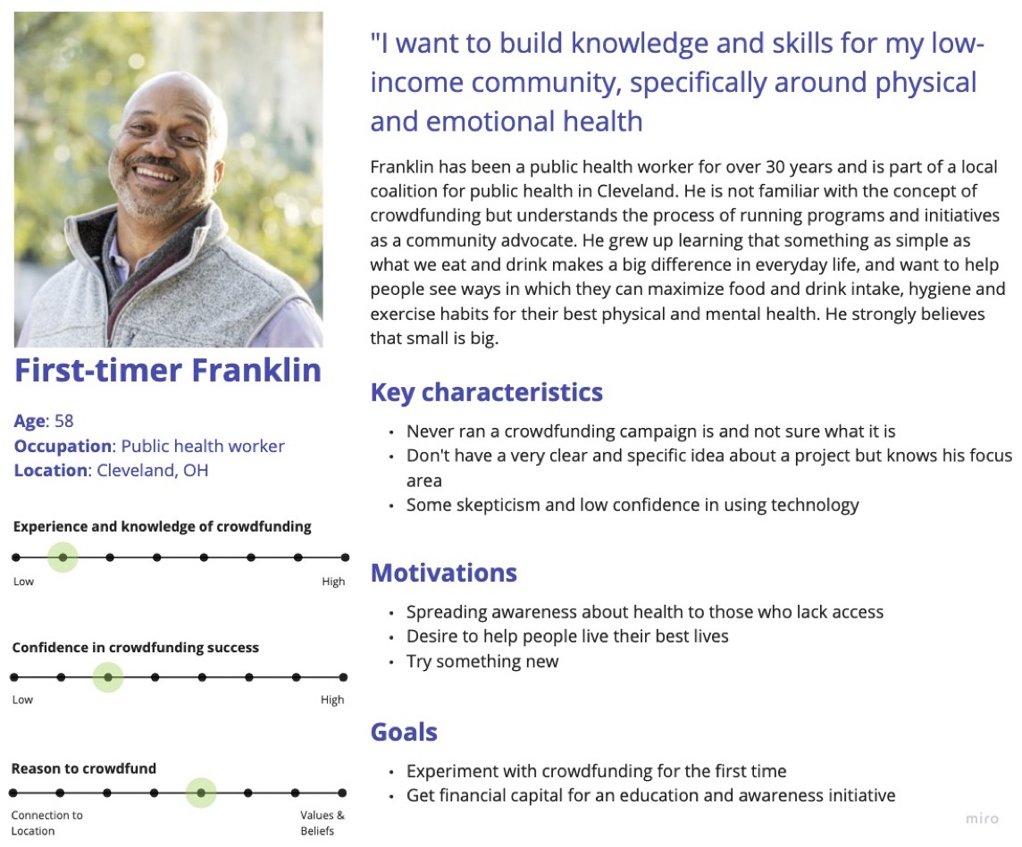
For project leaders (ioby's core users)
The painpoints they faced were that:
- The workflow from submitting their project idea to ioby, to launching and then getting their money disbursed, was overall not user friendly and felt time consuming, especially when it came to disbursements
- There was a lack of clarity around whether or not their project idea was even eligible for the ioby platform
- They had trouble finding socially, culturally, and/or geographically relevant projects
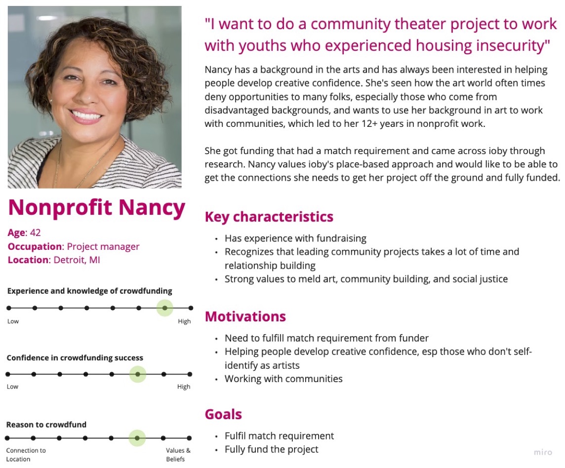
There were also some clear distinctions between people who had extensive experience with fundraising (whether they work in nonprofit or are grassroots community leaders) and those who were new to crowdfunding. Three personas were created based on discussions with project leaders, and from talking to ioby’s customer-facing staff members.
There were several different ways to look at the ioby journey. I first needed to get a clear understanding of how staff understood the 'sales' pipeline, especially since there were actually conflicting definitions for when and how a user moved forward in the pipeline. Reaching the below consensus required several discussions between me and Customer Success team leads. This was important for the Product team to know the conditions for a change in a project's status:
I then wanted to visualize the end-to-end experience that a project leader went through. Using my notes from my interviews with users and staff, and from testing the product, I mapped out key activities, goals, and the emotional experience of the ioby user journey from the perspective of Nonprofit Nancy. This not only helped highlight the biggest pain points and their emotional states, but helped the rest of ioby staff members get a better sense of what we were designing for and why certain parts of the journey required more focus.
Envisioning the end-to-end experience allowed me to think of both customer-facing and staff-facing opportunities for improvement. For example, I noticed that quite a lot of painpoints were programmatic issues, and likely required closer working relationship between the Product team and Marketing team to figure out copy/help text for user clarity and drip series emails for nurturing relationships.
ioby's organizational goal was to inspire and support residents to step into civic leadership and take local action for positive change. How do we transform this into a product mission?
I took pain points distilled from the empathy maps and reframed them into 'How might we' questions and noticed two core themes that would guide the design process:
How might we better communicate eligibility requirements? How might we eliminate confusion and stop gaps from the Drupal system? How can we set better expectations for working with ioby?
How might we make the hard process of fundraising easy? How might we lift some of the burden that comes with community organizing? How might we lower the barrier to civic engagement?
The priority while we were redesigning ioby was to build a sustainable foundation for ioby’s backend infrastructure given ioby’s tool sprawl. This was a big reason why the outcome of redesigning the external product was to build parity with the existing Drupal project page builder.
We didn’t want to introduce new features while organizing ioby’s data infrastructure and internal workflows, but we did want to take this opportunity to improve the UX in response to years of customer feedback in the backlog.
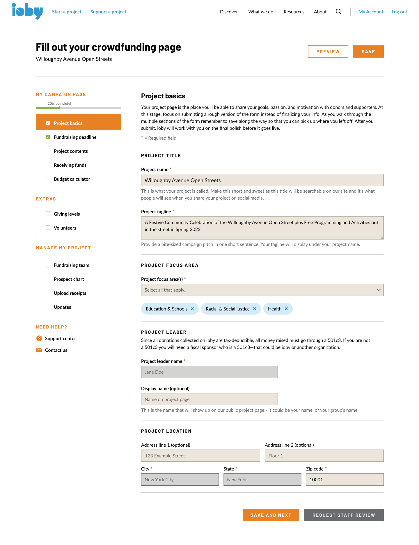
Given that, we planned to build a project page builder that:
- Presents content in chunks and offers a clear path to completion w/ a progress tracker
- Set expectations so project leaders have aclear understanding of hte amount of work needed to create a project page
- Was clear, easy to follow, and included legible help text
- Was mobile response
- Integrated with and auto-populated data from the 'idea form'
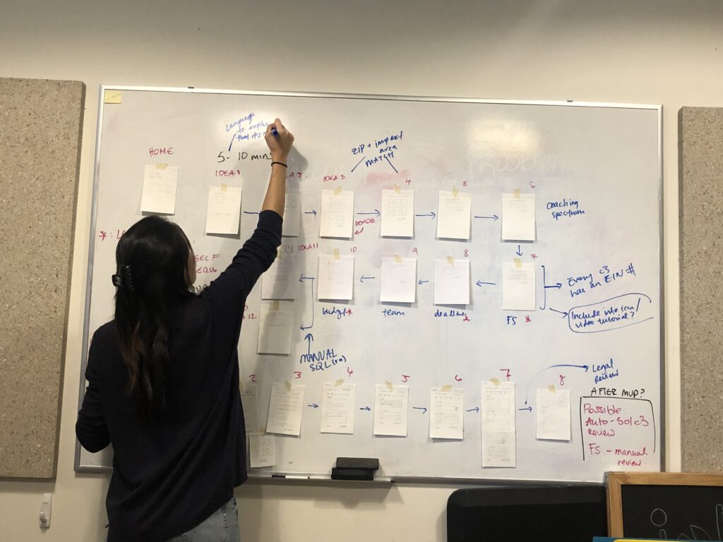
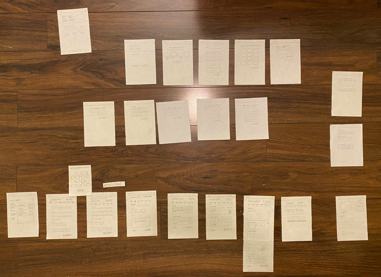
I first drafted rough sketches of a project page builder and proposed a basic, step-by-step/gamified user flow of the project page builder. We wanted every step to feel like a clear, empowering, and effortless, and users to feel like ioby had their backs at every step of the way.
Regardless of whether it was a power user or a first-time user, the first point of contact with the product for everyone was the 'idea form' - what ioby internally called "Stage 2". I worked closely with staff to think bigger picture. What was the purpose of the idea form? How did it differ from drafting a project page? The answers to those questions were:
- For customer success to know a user’s readiness and how much support they might require, especially since one of ioby’s unique value proposition was offering personalized 1:1 coaching
- To evaluate whether a project idea was even eligible for ioby services and match programs, since users struggle to recognize that ioby was for public-benefit projects only.
So how do we create a user experience for folks at all different levels of readiness?
Problem 1 - dependency on third party tools
The existing idea form was a one pager hosted on The Form Assembly (TFA) and embedded onto the Drupal site. Having the onboarding experience and the core product on two different systems meant staff had trouble keeping track of projects and had to manually connect a project idea to a project draft.
Solution
We simply built our own form to capture similar information we were already capturing before and new data to make it easier for staff to know how much time to allocate to certain projects.
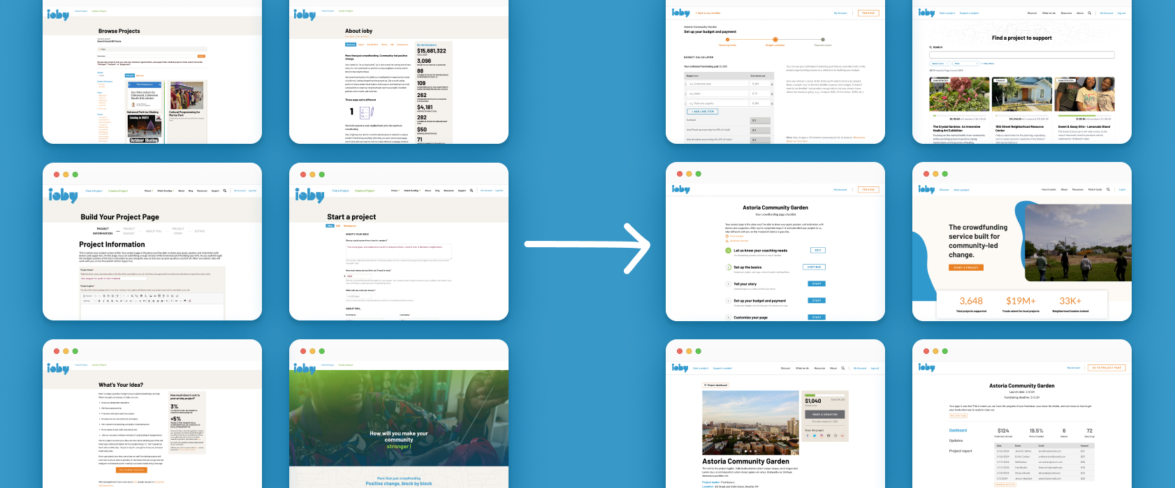
Left: old project page builder on Drupal, Right: New design of project page builder with progress tracker
New data we wanted to capture were:
- Project's impact area
- Whether or not the user has run a crowdfunding campaign before
- Type of team leading the project (e.g. are they part of a 501c3 nonprofit)
- Whether or not they had a hard deadline
- Whether or not the needed coaching, giving the option for users to opt in or opt out of ioby's 1:1 coaching services
The purpose of asking new questions goes back to the purpose of the idea form. Impact area was something we wanted to capture early as a way to improve searchability. The latter were all must-haves for customer success to determine whether a user was ‘sales qualified’, and how much attention should be given to the user and their project(s).
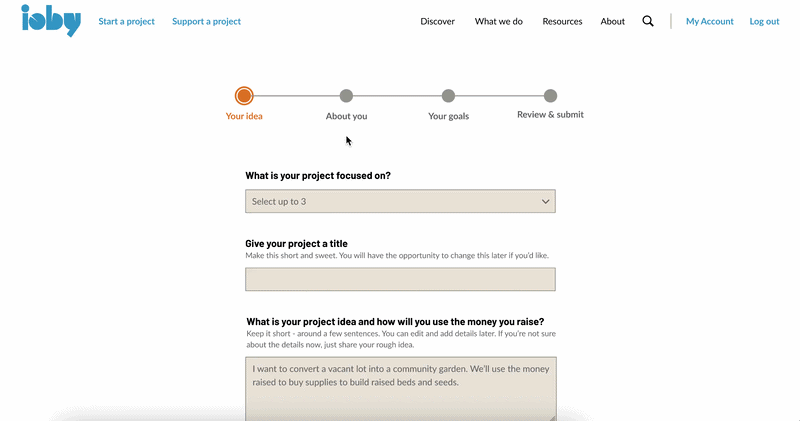
Early iterations leant towards the conversational form format. However, after review and testing, the feedback was that although this gamified version of an intake form was easy to follow, there were too many steps especially since there was conditional logic. The questions asked provided data for staff to work out whether or not the user was a sales qualified lead (SQL), but too much for the user to answer. We modified it to be a four step form with a progress tracker:
.png)
Early iteration conversational form idea form
Final iteration, four-page flow with progress tracker + mobile view
Problem 2 - Duplicate idea form submissions
Users didn’t receive confirmations or have any way of going back to an idea they’ve already submitted, which led to some users submitting multiple, identical forms. The duplicates were highly problematic for staff to keep track of on the backend too.
Solution
Users must have an account in order to submit an idea form. This was similar to user journeys I found across competitors and was the only way to tie a project idea record to a user on the backend. I came up with two ways to prevent duplicates:
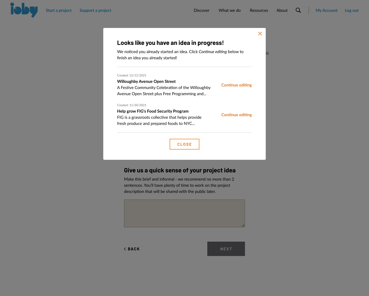
Clear CTA to revisit previous draft(s) -When a user is logged in and clicks the CTA to submit a new idea form, a pop up will show idea forms already in progress
Display existing idea submissions -
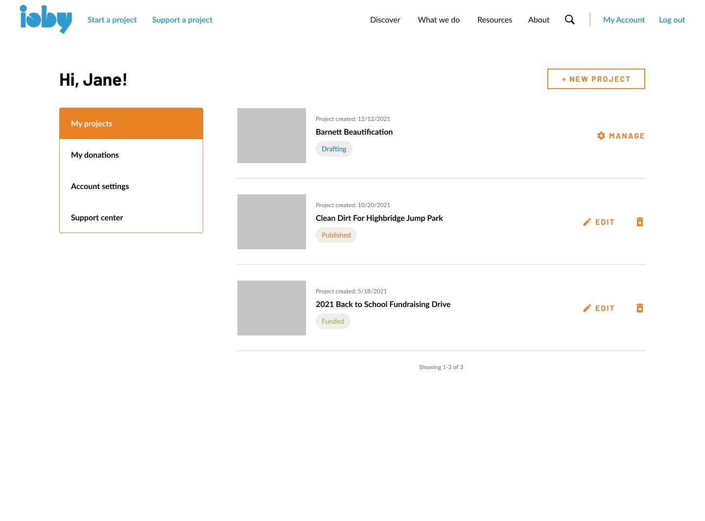
When logged in, users are brought to a their dashboard of projects including existing project ideas, projects in draft mode, published and live projects, and completed projects.
The latter was the easiest to implement AND it meant that for users with multiple ideas, they wouldn’t be forced to see the pop up for every new submission.
This also served multiple purposes not just for users to see idea forms already in progress, but to keep track of all projects, past and current, with clear indicators for whether the projects associated with the user are in “idea”, “drafting”, “fundraising”, “funded”, “complete”, “cancelled”, “archive” stage.
Problem 3 - Users stuck in "Stage 2"
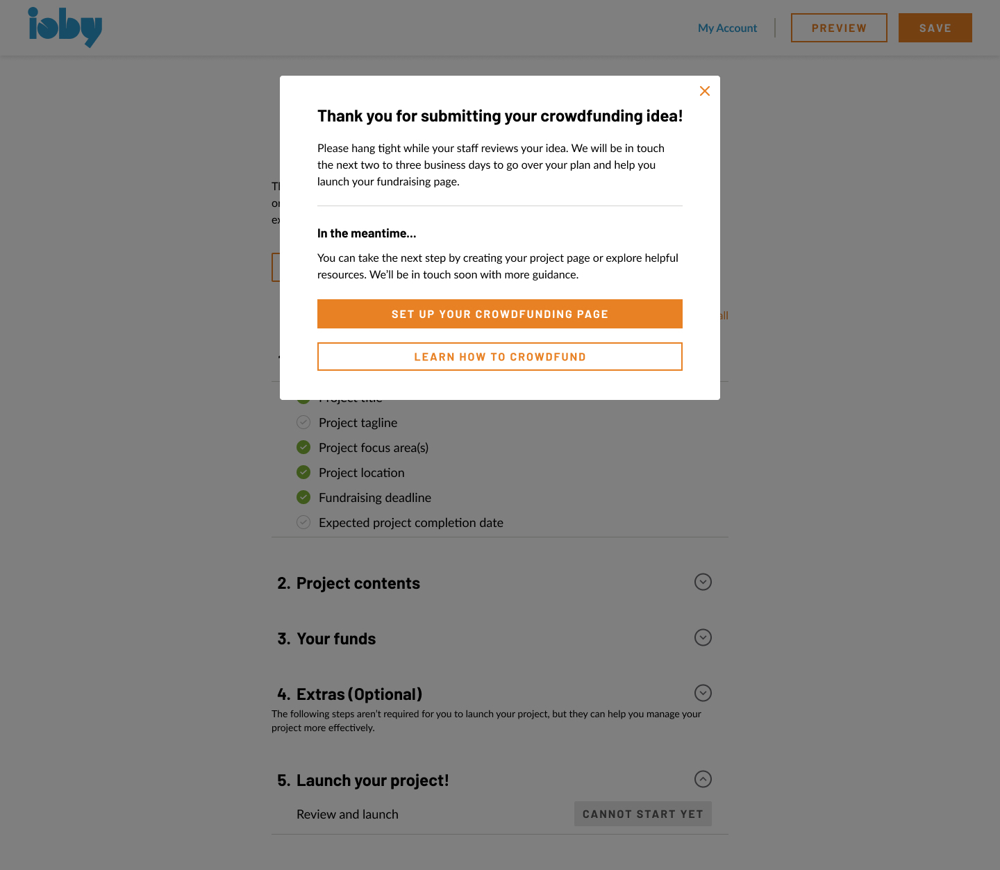
We noticed an excess of users who never made it to the project drafting stage after they’ve submitted an idea form. Users (especially those who are less tech-literate) weren’t sure what to do once they landed on the post-submission landing page. So what was it about the existing flow halted users from moving through to the next stage?
Original post-submission landing page
The language users saw in the original product was “hang tight while our staff reviews your idea”, with the CTA to start building out the project page being at the very bottom - it’s no wonder that folks struggle to move through. ioby had purposely built a barrier for staff to review eligibility first.
Solution
Staff noted that while ioby needed to make the final call on eligibility, the ideal was that the product encouraged the user to move through without friction and start drafting their page if they so choose. In the existing flow, an email was sent to the user once ioby staff have reviewed the project idea with a link attached to start drafting the project page. This user experience, however, was not seamless. According to customer success, the idea was to encourage users to start drafting.
My design replaced the text of this landing page to a pop-up modal - it included the same messaging around staff reviewing the idea’s eligibility. This would lower that barrier to move forward slightly given the temporary nature of a pop up modal while alerting the user of what to expect.
Since the core product was made up of a composite of third party platforms tied to Drupal, there were both technological and workflow challenges:
Technological -
- Third party tools were connected by thin threads that broke easily. They weren’t designed to do what ioby was using them for and Drupal and Salesforce were acting as data warehouses
- ioby was not gathering that data it needed to come up with solutions to improve the user experience
Workflow -
- Users had to wait for staff to step in and conduct a manual change at many stages just to move forward in the user journey
- Users generally being unsure about eligibility requirements and expectations of working with ioby, resulting in back and forth communication between users and ioby
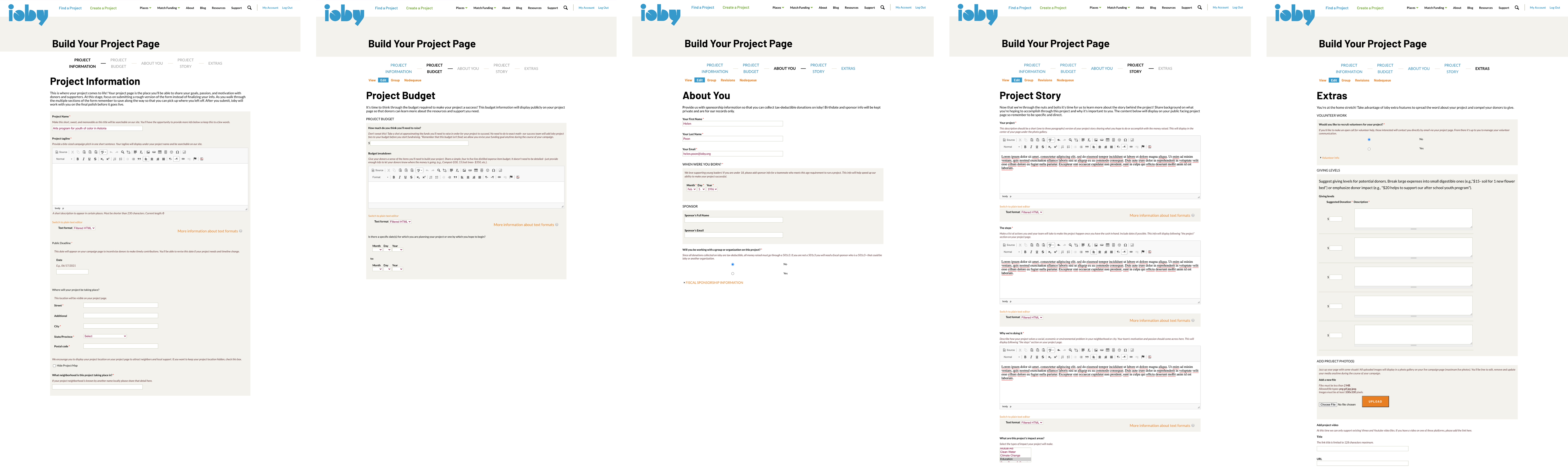
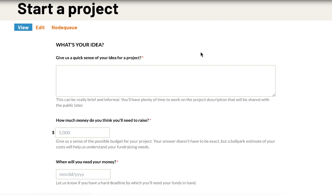
The original project page builder in Drupal CMS that needed redesigning
Problem 1 - lack of clarity and expectations:
The existing design was already presented in chunks: project information, project budget, about you, project story, and extras. We wanted to improve this by removing any unnecessary form fields, provide help text, and show progress.
Solution
My first design idea was to show a navigation menu on the side in a checklist format, which showed when sections were complete.
Early design draft of the project page builder
My first design idea was to show a navigation menu on the side in a checklist format, which showed when sections were complete.
I included a progress bar to help push users along to complete what’s required, paired with help text that clearly signals to the user if required portions of a section are complete. This was important because there were a number of form fields and sections that were optional, which was why we also separated out parts of the project page builder that was optional but could be helpful for users
After testing this new design internally and engaging in crits within the Product team, I started to think less is more. How could I make it even clearer and less overwhelming for our audience, most of whom err on the lower tech-literacy side. What if we just showed the checklist as a high-level landing page for users to keep track of what they still need to do?
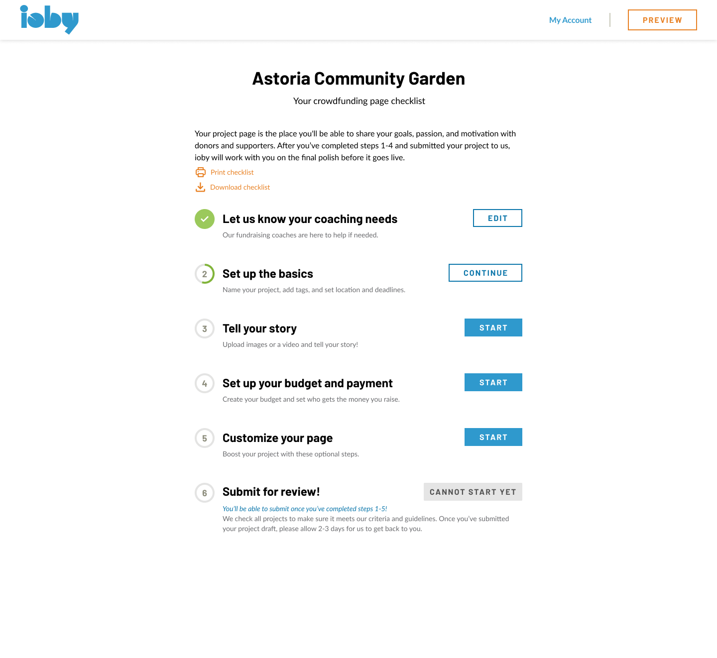
To stay consistent with the idea form’s design, we included progress bars for each section, essentially showing what needs to be filled in for each category of the high-level checklist
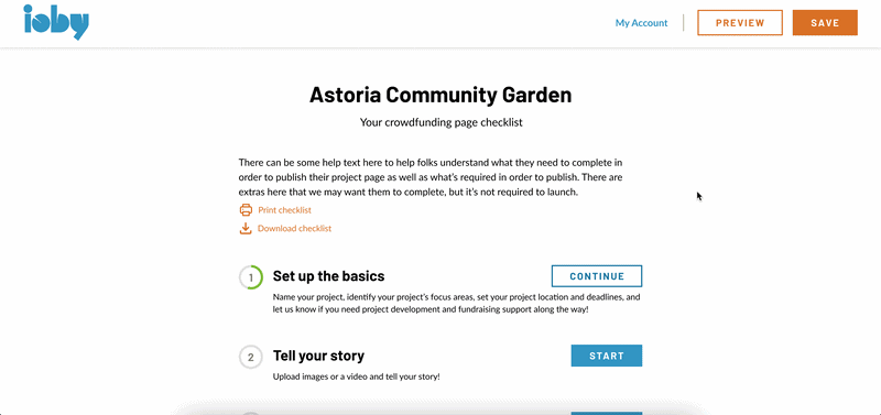
This iteration was the most well-received during the co-design sections. Folks liked the gamified version of the building process, the high-level checklist to see what needs to be done at a glance, and the more minimal design freed up room to include help text at every step of the way.
Problem 2 - confusion about fiscal sponsorship:
Offering fiscal sponsorship was one of ioby’s uniques selling points. ioby helped fund a number of grassroots organizations that didn’t have 501c3 status and came to ioby for fiscal sponsorship to get tax deductible donations. Many users actually had no idea what fiscal sponsorship was and why it was required in order to crowdfund on ioby, and totally skipped answering the extra fields about fiscal sponsorship in the original Drupal form.
Solution:
To make it as simple as possible, we asked a simple question: “Who will be receiving funds raised on ioby” with multiple choice selection. It helped that the new format allowed us to include help text, and I worked closely with staff to draft copy and highlight the definition of a fiscal sponsor.
I designed it so that it was a conditional form. Depending on what the user chose, we either required them to fill out their fiscal sponsor’s information or signal to the user that they may qualify for ioby’s fiscal sponsorship program if they’re not already working with a 501c3.

Having users self-identify their fiscal status would dramatically cut down the time staff spent explaining this requirement while also giving staff the information to know how and what to communicate with the user.
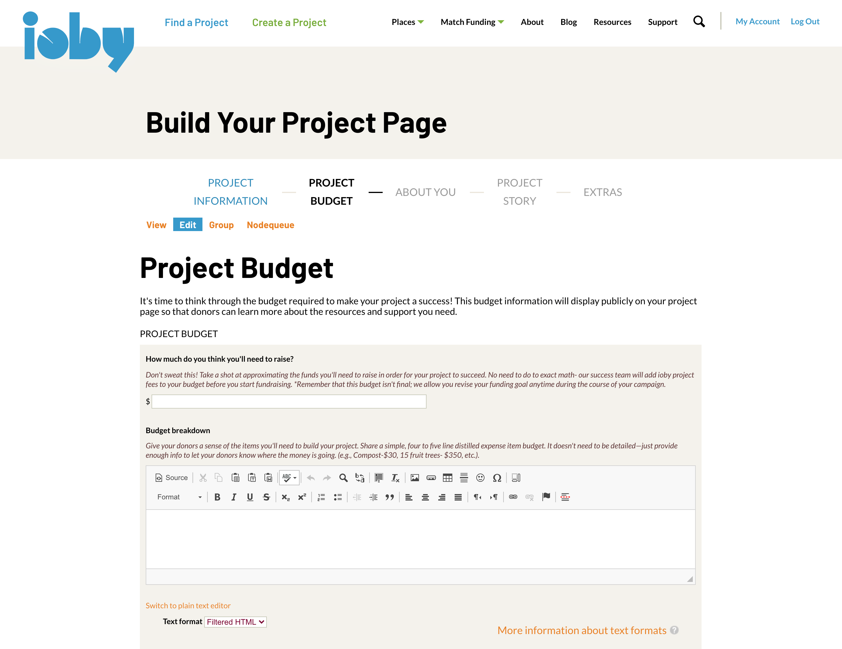
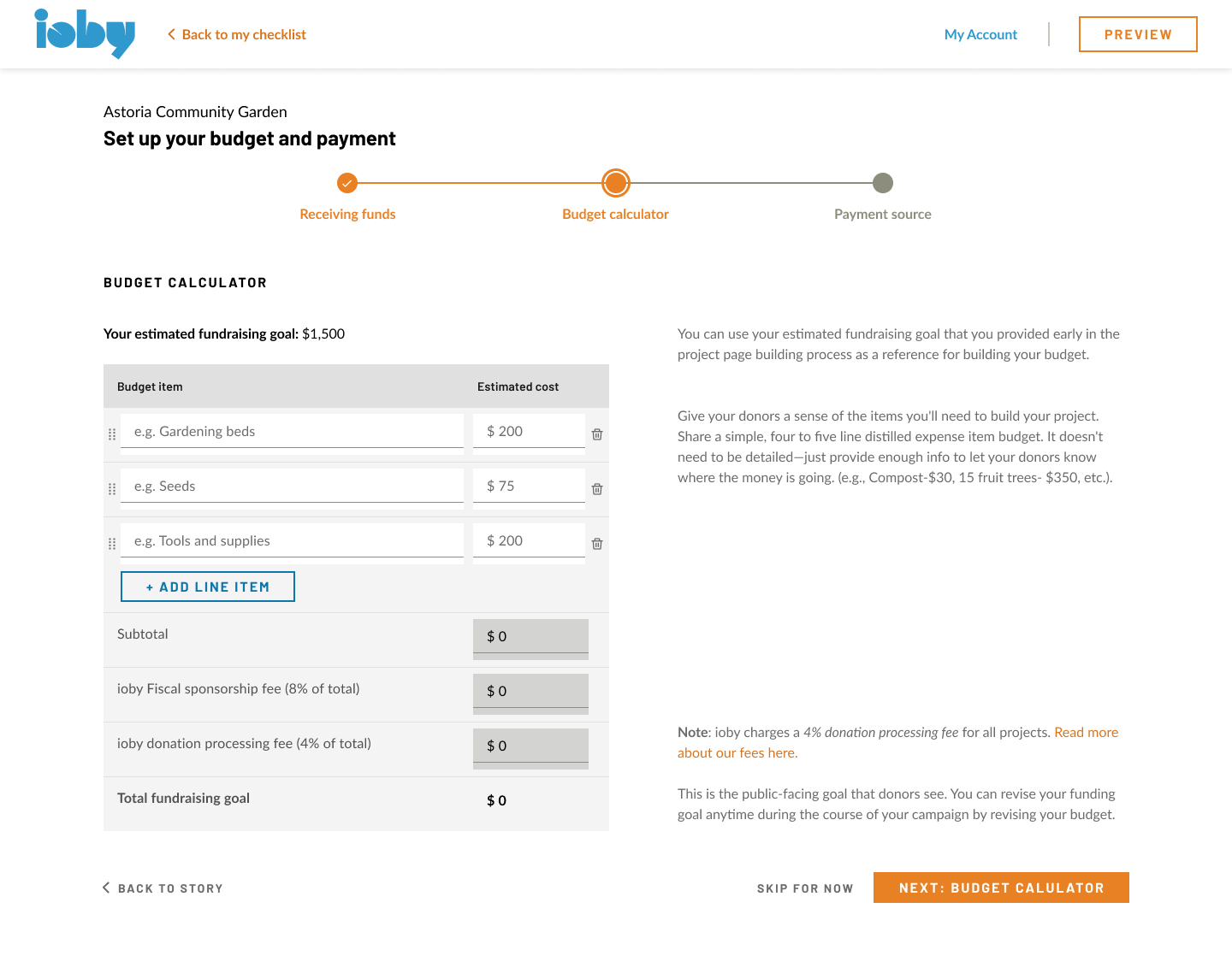
Problem 3 - Complications with the budget:
The old Drupal product simply asked users to write a budget with a rich text editor. There was no standardization for how a budget was formatted. For an organization that deals with money, fiscal sponsorship, and reconciliation to make sure the funds were used as intended, this was a problem both for workflow and accounting reasons.
Users simply put in text or a copy and pasted excel table, which made it impossible to capture data. The fees also needed to be added in by a staff member after the user reaches out to customer success. This led to a lot of back and forth between the user and staff.
Solution:
I designed a two-columned tabled budget that auto-calculated fees depending on the project’s fiscal status, which the user self-identified as described above. The fees were applicable to any project where ioby was the fiscal sponsor - 8% of what the user raised went to ioby as part of the organizations’ fee structure. The 4% donation processing fee applied to all projects.
Given the nature of a major redesign and migration from 0-1, there were core parts of the product outside of the onboarding and crowdfunding platform that I designed, including:
- Establishing a new design system for our SWEs to use
- Working closely with ioby's CMO to establish the sitemap of the product marketing site
- Designing the product marketing site
- Redesigning the checkout flow
- Designing a new workflow for reconciling receipts, which ioby previously did not have
- Redesigning the log in and sign up flow, as well as the user account dashboard
- Helping establish a digital inclusion policy to ensure ioby's technology and services are intentionally equitable
You’ll notice in the final design that there’s a side navigation that was added. This was added as part of designing the User Account flow and for the donor who wanted to keep track of donations and download receipts.
The project page builder was the foundation of ioby’s product, and we wanted to make sure what we were working on had the intended outcomes that met the organization’s goals.
|
| Reduce time to review project ideas by X hours for strategists | Time dedicated to reviewing project ideas |
| Ioby strategist staff satisfaction | Via survey |
| Reduce the number of spam project ideas and repeat project idea submissions | # of spam, # of duplicate ideas |
| Capture amount of time spent on project page builder from idea form submission to project draft submission | Time to task completion |
| Reduce staff time spent on explaining the project page building process | Survey for strategists / back-of-envelope estimates |
| Track Conversion from onboarding to building a project page (stage 2-3) | Time on task / timestamps |
| Track Stage 3 abandonment | Drop off points at project builder |
This table combined both the onboarding part of the core product, the idea form, and the page builder itself. There were two overarching themes here:
- Understanding the impact of the redesign internally, specifically for staff who are the most customer-facing, and
- Capturing accurate data consistently
The former is due to a larger organizational goal of improving the workflows of ioby’s human resources who elevate and support civic leaders. The latter for foundation setting for ioby to be a sustainable tech-forward organization. Prior to having an in-house product team, ioby only had estimates for the amount of time strategists spent helping leaders with project development.
The rationale for the first three goals center around the onboarding experience in particular. The customer success team did a capacity utilization survey with the findings being that time spent serving project leaders in stage 2 (interest, idea submitted) and stage 3 (committed, drafting project) were:
- For users who are not new to fundraising:
- 15 min for stage 2 users
- 18 min for stage 3 users
- For users very new to fundraising:
- 45 min for stage 2 users
- 54 min for stage 3 users
The goal was that Customer Success would spend no more than 5-10 minutes on serving users at stage 2. At this stage, customer success should already have enough information to determine whether the project was eligible for ioby, for an ioby match program, and if the project idea was fleshed out enough to move on.
The hope was that by making sure the idea form was capturing only the most crucial information that it’d be easier to evaluate a project’s likelihood of conversion, while also making it easier for experienced users to move through to the next stage seamlessly.
Had ioby not sunsetted, I would have followed through with measuring the outcomes of the new launch, seeing if there was a decrease in time spent troubleshooting and explaining among customer success staff, capture task completion time compared to the back of envelope estimates we had when ioby was on Drupal, and track drop off rate especially in the new flow where it was much easier to track parts of the page builder where people could get stuck. However, it is with a heavy heart to say that ioby had to shut its doors shortly after the product launched.
This was a massive redesign undertaking that I was definitely quite proud of as the sole designer working within a small team. It taught me how to prioritize work, how to juggle demands from stakeholders, how to collaborate very closely with engineers on a daily basis, the nonprofit world and the intricacies of fundraising, and so much more. The feedback from staff around this work was overwhelmingly positive, considering this was the biggest change to ioby’s product since its inception.