
problem
A brand without a distinctive voice online
Problem
The company lacked a strong brand voice in its online presence, especially at a time when all leisure shopping has shifted online due to Covid.
Objective
Establish a cohesive brand guideline to drive a stronger voice through e-commerce and digital marketing, to ultimately increase traffic and sales.
Audit
What we had originally
A website redesign was long overdue for Annika Inez, but what needed to come first was a clear brand voice and mission statement, one that emulates the creative and artistic spirit that Annika Inez champions. I did a quick audit of the existing site. There were general improvements that could be made, and on the homepage alone:

- 01Too much text on hero image, and taking focus away from navigation
- 02All homepage imagery looks similar. The company notes 5% of all sales will go to ‘Building Black Bed-Stuy’ in support of small, Black-owned businesses, but showing only a white model
- 03White text is hard to read on top of the model imagery
- 04Lack of sections showcasing different parts of Annika Inez’s jewelry collection, apart from an ‘About’ section
- 05Live social feed is broken due to API issues with Magento 1
- 06Important policy information stored under one page, “INFO”, resulting in more inquiries and confusion from customers requiring shipping and returns
Research and insights
Who shops Annika Inez?
The typical Annika Inez customers are women around ages 20–45, based in North America or Europe, with an inclination towards art and unique designs. This is based on a customer insight survey I sent to existing newsletter subscribers, with 38 responses from existing and potential customers.
Persona type

Works at a large, creative company. She’s college educated and mid-career. She’s foundationally classic and minimalist, with Acne Studios and Lemaire being some of her favorite brands, and occasionally mixes things up with vintage statement pieces.
She spends her weekends with family, going outdoors, volunteering with her PTA. When she goes out, it’s usually drinks with friends in West Village or Brooklyn.
Change in shopping habits
Shopping habits have changed dramatically during the pandemic, and Annika Inez customers have responded showing a gravitation towards:
- Investment, high value pieces
- Timeless styles
- Sustainable items for long-term use rather than fast-fashion
- Supporting small businesses
What customers need from the site

Most customers like to browse, but the initial thought here was to implement a filtering function for the portion of customers who shop with a specific purchase in mind.
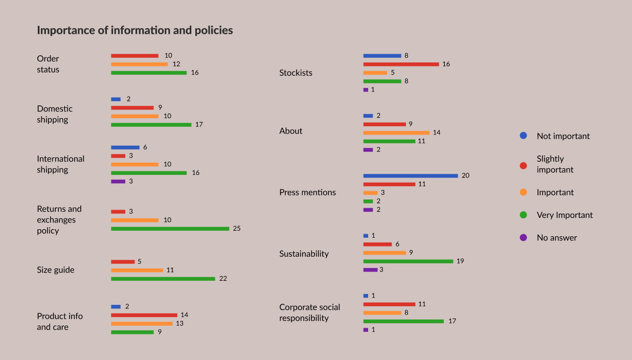
Due to the pandemic, customers are looking more closely at returns and exchange policies online. They’re also reading into the company more in wanting to support smaller, more sustainable, and/or minority-owned businesses.
Customer feedback: more imagery and clearer policies
There weren’t any huge issues with the existing site. All the product images were professionally shot and the website functions as needed. Customer feedback on the existing site showed a need for more imagery and clearer policies.
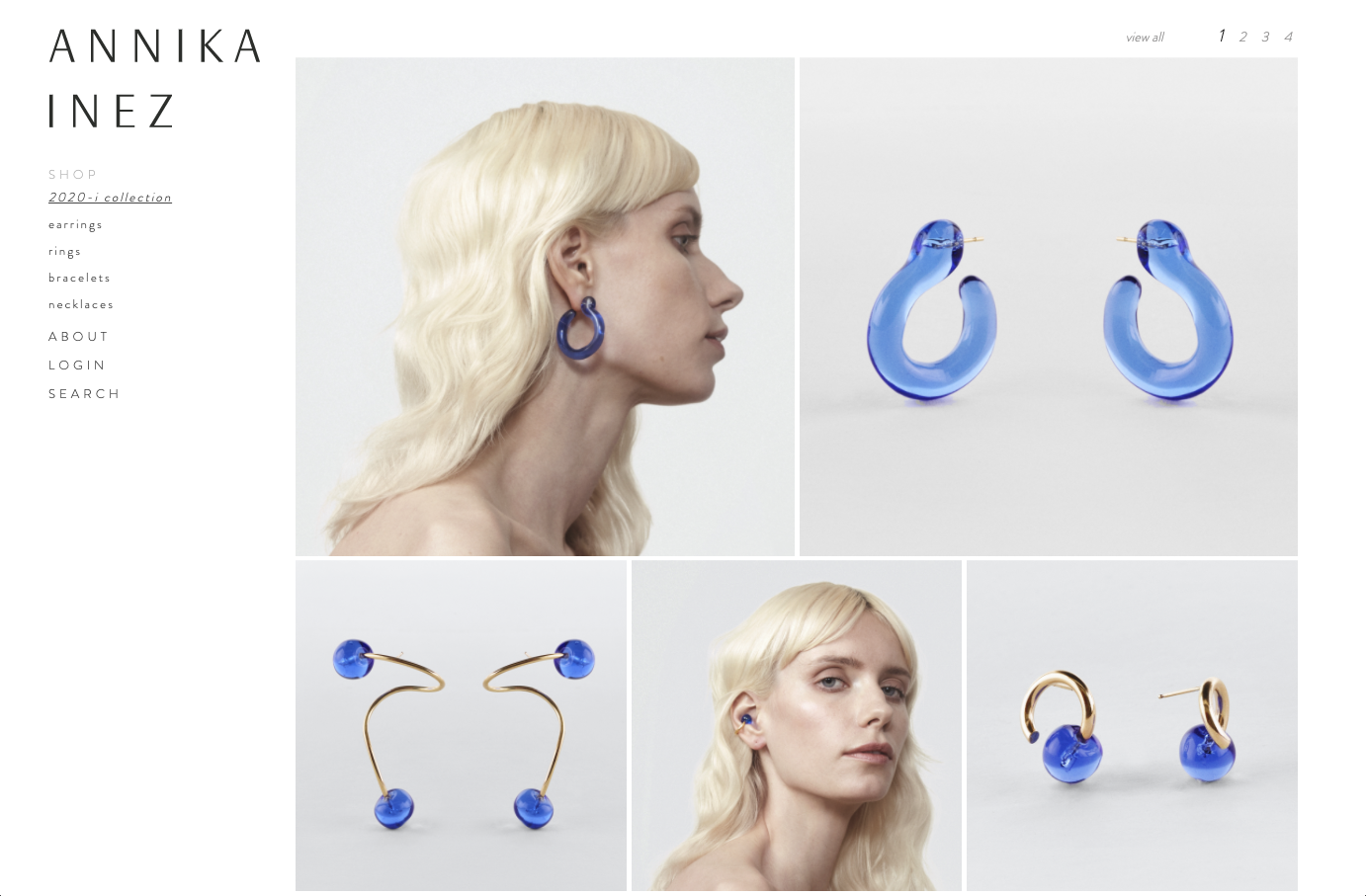
The main callouts that customers made were:
- Not enough images of the pieces being worn
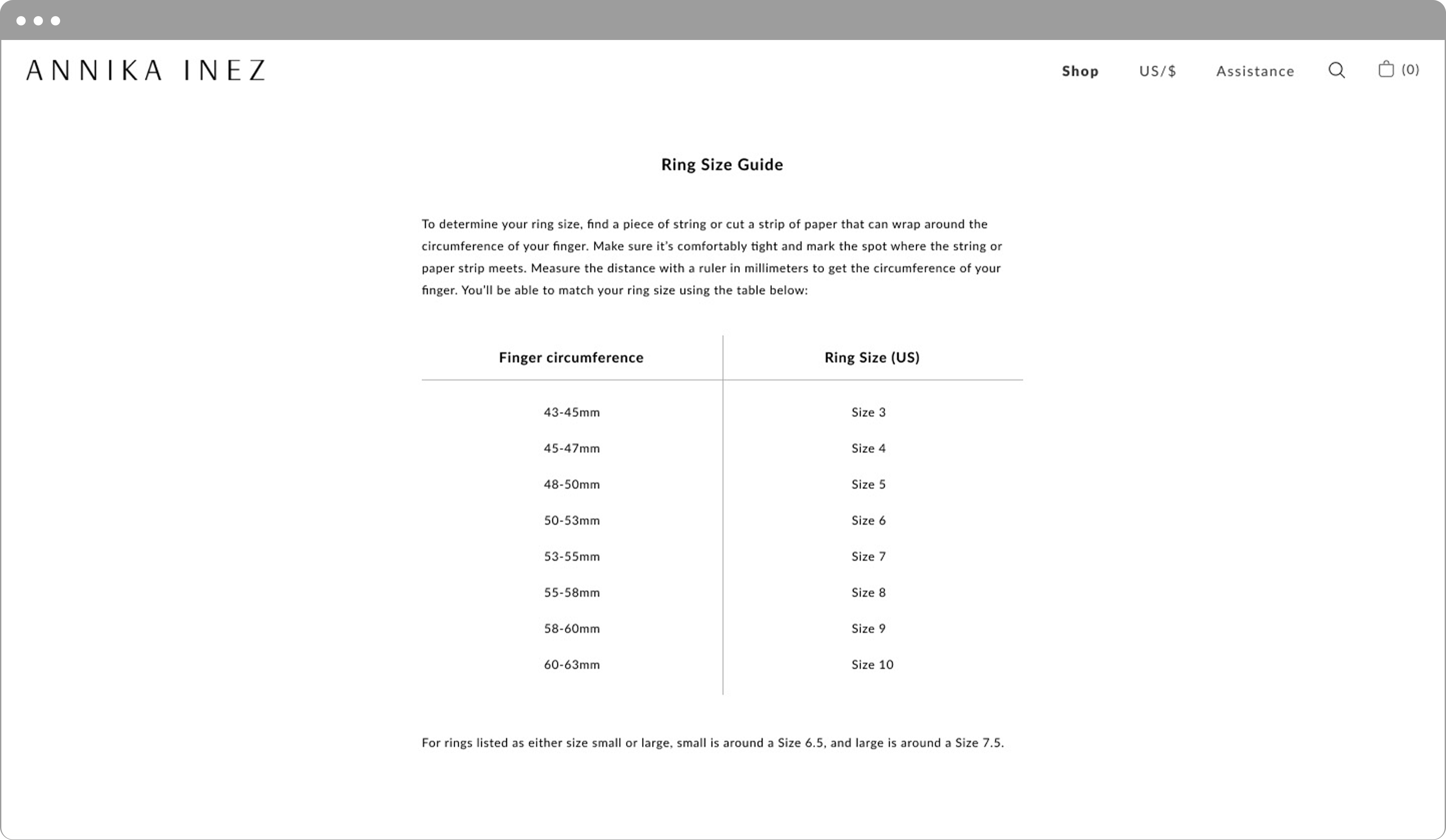
- Want better explanation of shipping and returns policies
- A comprehensive size chart for rings would be helpful
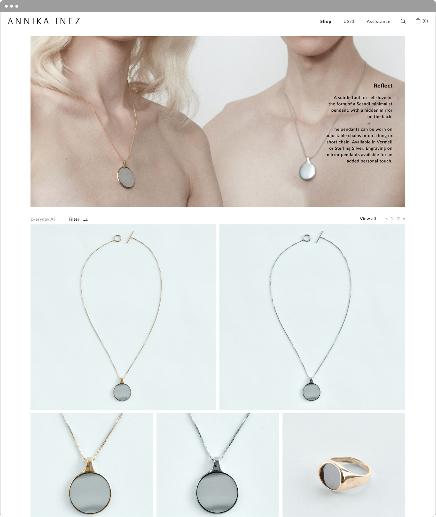
- Ability to view by color or have some sort of filtering option
“The jewelry designs are very creative, so it’s hard to imagine how it fits.”
“I want to see someone wearing the jewelry that I’d like to purchase.”
Concepting and testing
Drafting up designs
With the research and feedback in hand, I set three goals for the redesign:
- Introduce more diverse imagery
- Differentiate sections with the inclusion of call-to-actions to explore more
- Give the brand more context through storytelling


Testing with 14 users
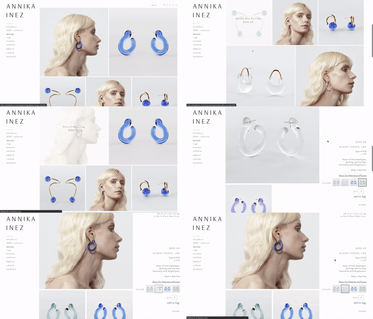
I tested my prototype on 14 individuals before presenting my proposed designs to Annika. The biggest confusion in my first design was that I maintained the gallery layout of the category page from the existing site. Users were confused by the category page because it looked more like a lookbook rather than a product listing, due to inconsistent photo styles.
With user testing feedback in mind, I designed a category page showing only product images. Because the brand is higher end, Annika doesn’t want price to be immediately visible. I therefore proposed that name, price, and color variations, and model image be visible only on hover.

Brand and style guide
Establishing brand values and a new style guide
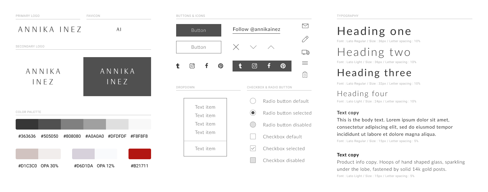
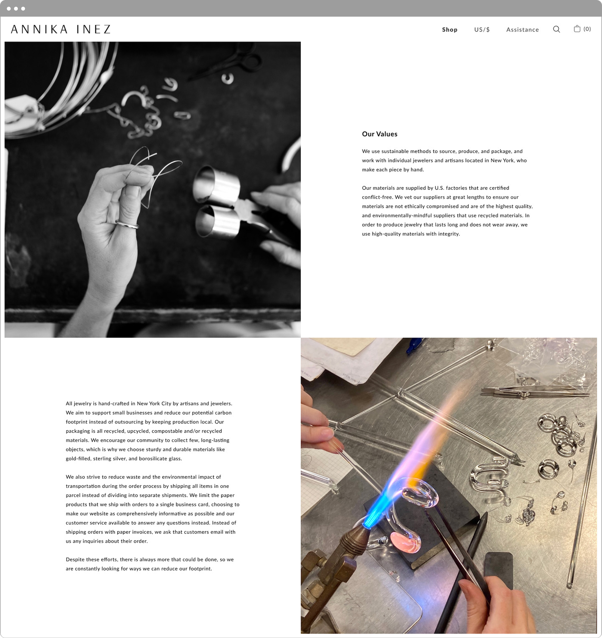
A big part of Annika Inez’s marketing direction revolves around inspiring creativity and giving reverence to the small things and moments in life. Knowing these values gave everyone a sense of direction for the company’s future outputs.
Ethical
We use sustainable methods to source, produce, and package. Our materials are supplied by certified conflict-free U.S. factories, and all jewelry is handcrafted in NYC by local artisans and jewelers to support small businesses and reduce carbon footprint.
Spiritual
We elevate our spirit by honoring our personal expression and grounding our bodies in the present. We encourage respect for the materials we employ and consideration for how they serve us, and we take notice of the little moments that make up our daily lives.
Societal
We believe in enriching the small business economy and emphasize slower, higher quality production. We are passionate about building a more equitable future, and pledge a portion of our profits to various organizations that target social issues.
Style and artistic inspiration
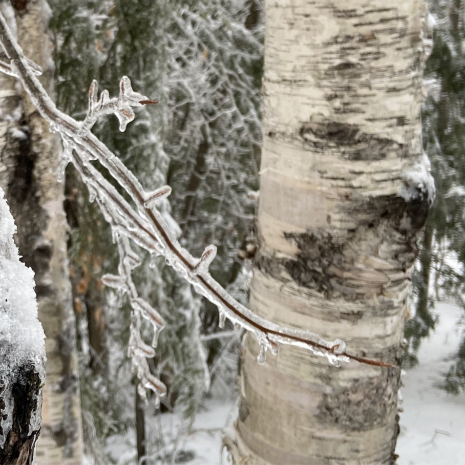
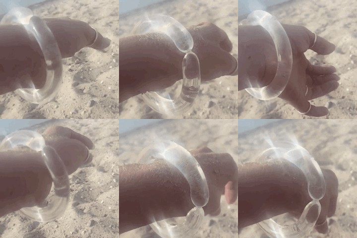
In terms of visuals, one of the biggest features the company wanted to include was moving image in a ‘diptych’ like layout, pairing a still image with video.

Final design
Weaving in the new branding
Presenting my designs helped the team visualize how the site could look, what elements we could pull from the brandbook as it was being finalized, and how we could iterate the design to better match the new branding, both in design and copy.
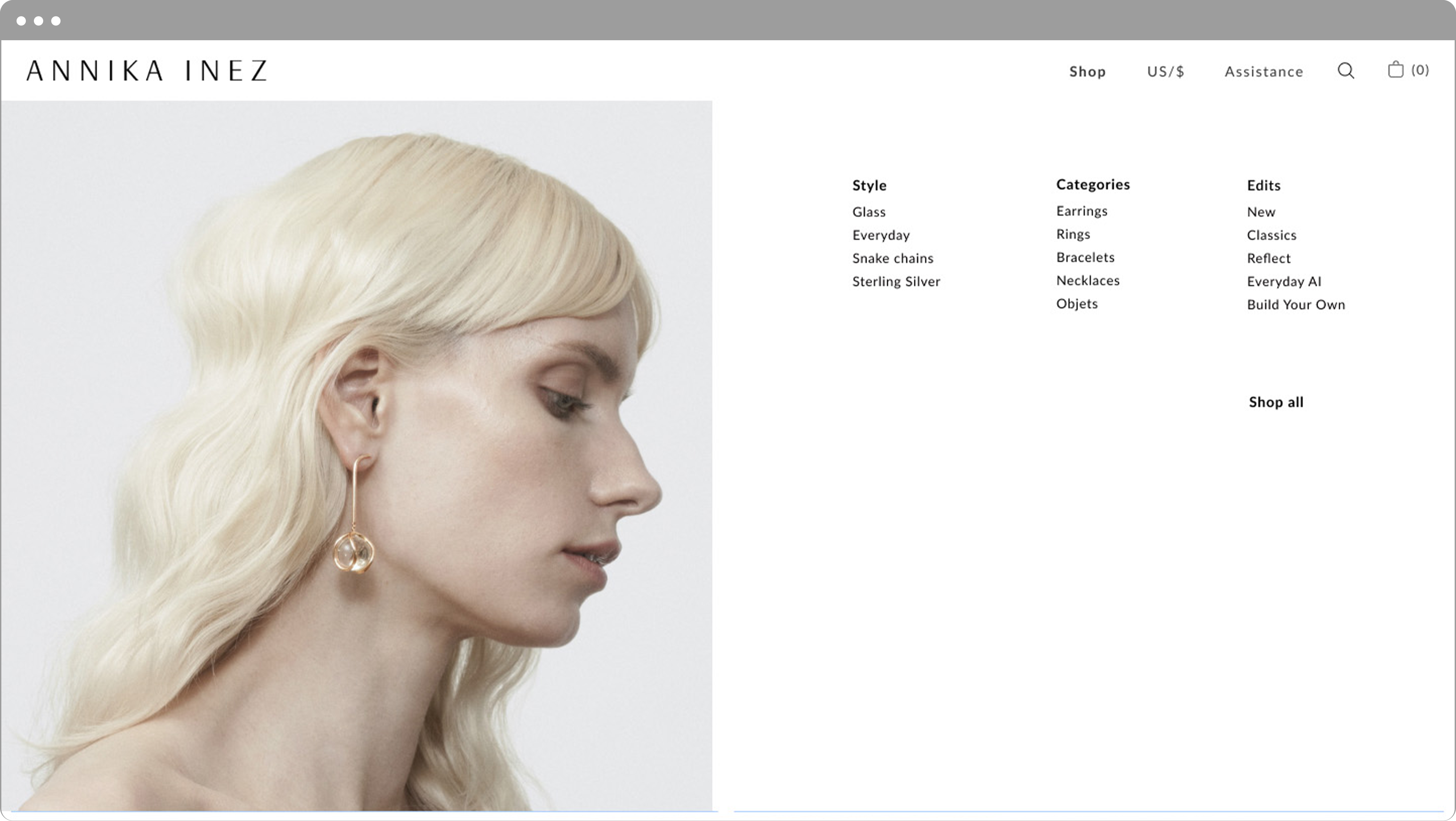
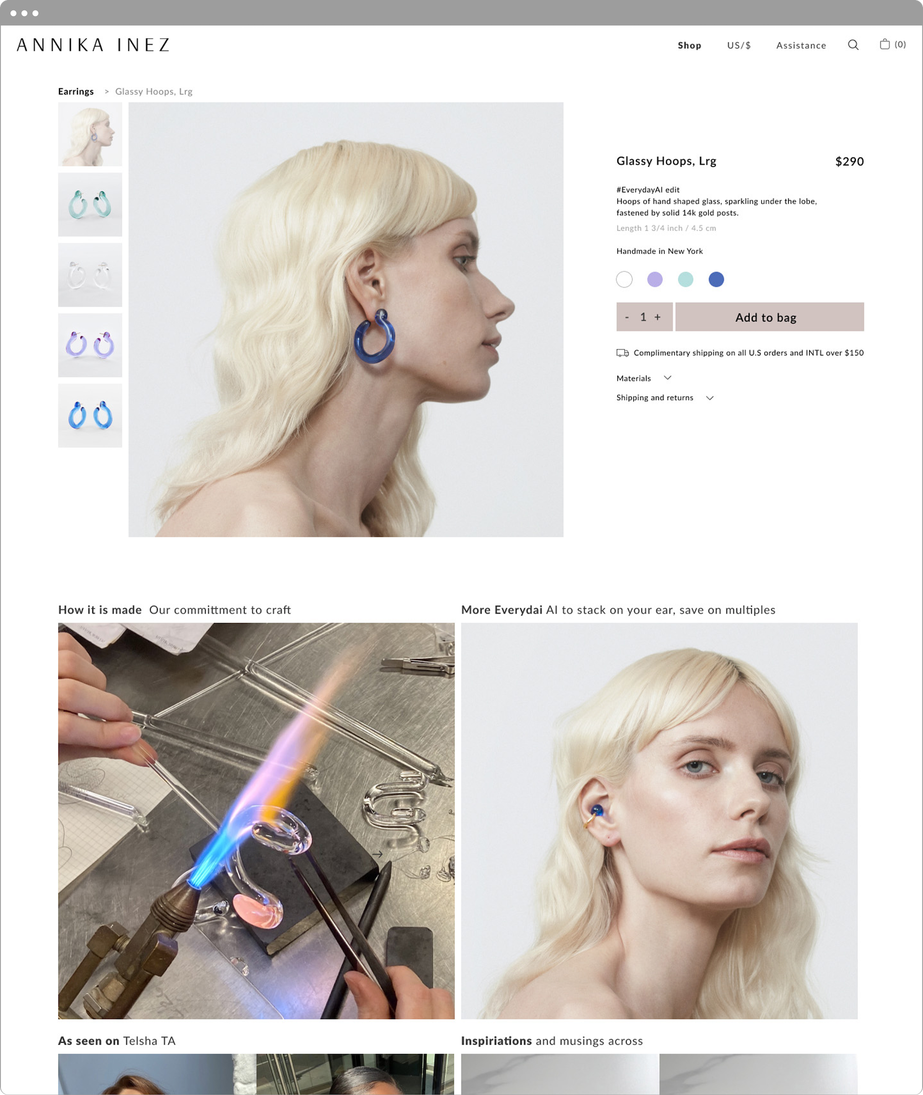
A typographic element Annika wanted to highlight was the juxtaposition of bold and standard font to create emphasis on important words. We used neutral and warm tones instead of the greys from the previous site. The navigation was redesigned into a mega menu to showcase more on-model jewelry on hover. Each collection series and campaign was given emphasis through a hero image, with copy describing the series and the inspiration behind it.
Final design, after Annika’s edits



Outcomes and learnings
Post-launch efforts
The Shopify platform is much more intuitive and comprehensive in terms of tracking sales, managing orders, and uploading products and collections, compared to Magento 1. With the new site launch, I integrated newsletter marketing through Klaviyo, switching from Mailchimp, as another means of tracking sales, sending automations and increasing traffic. We’re able to leverage tools that were not as readily available (or intuitive) on Magento 1.
I owned the redesign, the move from Magento 1 to Shopify, and the Klaviyo setup. In the 6 months after launch, compared with the year before, unique visitors grew 200% and orders grew 19%. Most of that growth came from the new digital marketing the platform made possible. The redesign’s clearest effect was on support: with policies easier to find, customers asked fewer questions about shipping and returns.
more unique visitors in the 6 months after launch, compared with the year before
more orders over the same period
Takeaways
Present as much data and research up front
As important as it is to design with a ‘user-first’ mentality, there are challenges to designing in a more creatively driven industry like fashion, and working with individuals who are more driven by creativity than by usability. Having data and user quotes gets the point across.
See things with fresh eyes
Feedback from real users is incredibly valuable. There are some aspects of the design that I didn’t catch because I’ve worked with the company for a while.
Provide as much information to the developer as possible
One of the most challenging things about working with a freelance developer is the danger of scope creep, as we continually found design flaws that we hadn’t caught in the beginning, causing a few rounds of back and forth with the developer.


